article thumbnail

Remove Your Rose Tinted Glasses: Data Visualizations Designed to Mislead

datapine

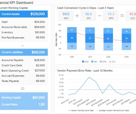
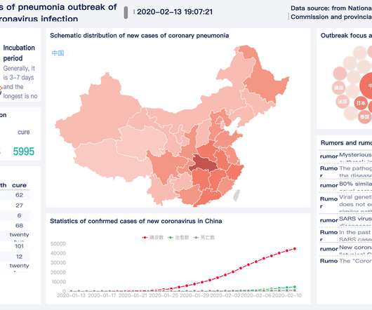
1) Misleading Data Visualization Examples. 2) How to Avoid Misleading Visuals. 3) The Impact Of Bad Data Visualizations. But while that may be the case, people are duped by data visualizations every day. Bad data visualizations come in many forms, with some more obvious than others. Table of Contents.

article thumbnail

3 Central Tendency Measures – Mean, Mode, Median

Analytics Vidhya

The post 3 Central Tendency Measures – Mean, Mode, Median appeared first on Analytics Vidhya. ArticleVideo Book This article was published as a part of the Data Science Blogathon. When we learn Data Science as beginners we came across.

Insiders

Sign Up for our Newsletter

This site is protected by reCAPTCHA and the Google Privacy Policy and Terms of Service apply.

Trending Sources

article thumbnail

Master Data Visualization Techniques: A Comprehensive Guide

FineReport

Data visualization techniques are paramount in today’s data-driven world. Mastering data visualization techniques is not just a skill but a necessity for professionals across various industries. Definition and Importance Visualizing data involves representing information through graphical elements like charts and graphs.

article thumbnail

Measure performance of AWS Glue Data Quality for ETL pipelines

AWS Big Data

AWS Glue Data Quality reduces the effort required to validate data from days to hours, and provides computing recommendations, statistics, and insights about the resources required to run data validation. On the AWS Glue console, under ETL jobs in the navigation pane, choose Visual ETL. In the Create job section, choose Visual ETL.x

article thumbnail

A Brief History of Data Visualization

Jet Global

Editors note: This blog was originally published in October 2013, and has been completely revamped and updated for accuracy, relevancy, and comprehensiveness in September 2019 Prior to the 17th century, data visualization existed mainly in the realm of maps, displaying land markers, cities, roads, and resources.

article thumbnail

Chart Snapshot: Functional Box Plots

The Data Visualisation Catalogue

While this visualisation technique is a variation of the classic Box Plot , a Functional Box Plot is visually very different and instead plots a combination of lines and areas to communicate the various data ranges. This region provides a robust measure of the spread of the central 50% of the curves. IQR rule for traditional Box Plots.

article thumbnail

The Fascinating Role of Data Visualization and Techniques for Assorted Variables

Smart Data Collective

While the collection and processing of data involves a lot of technology and expertise, creating a visual representation of the data, which can be read and understood by one and all, also requires an intuitive excellence. Such excellence predominantly is needed to select visualization formats for a specific set of sample data.