Remove 2014 Remove Business Intelligence Remove Dashboards Remove Visualization
article thumbnail

NHL turns to venue metrics data to drive sustainability

CIO Business Intelligence

The new platform furthers the sustainability journey the NHL started in 2010 when it inaugurated its NHL Green initiative to promote sustainable business practices across the league. IT-driven sustainability The league released sustainability reports in 2014 and 2018. SAP is the technical lead on NHL Venue Metrics.

Metrics 144
article thumbnail

Dresner’s Point: Ready for the “2014ization” of Business Intelligence?

Howard Dresner

Instead, let’s kick start the year with some definite plans and aspirations of companies in the business intelligence sphere. What is your organization planning to try to achieve in 2014? Will it have legs in 2014, I asked? I’d love to know what plans and aspirations your company has for 2014.

Insiders

Sign Up for our Newsletter

This site is protected by reCAPTCHA and the Google Privacy Policy and Terms of Service apply.

article thumbnail

Feeding America turns to data to feed the hungry

CIO Business Intelligence

Central to Byrdak’s multi-year transformation plan is the expansion of MealConnect, the first nationally available food rescue and sourcing platform, and a new data warehouse to anchor an analytics offering that helps food banks analyze and visualize their food sourcing and distribution data. Analytics, CIO 100, Data Management

article thumbnail

QlikView vs Qlik Sense vs FineReport, who is better BI tool in 2023?

FineReport

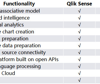
Introduction to Qlik Sense Qlik Sense is an interactive BI product released by QlikTech in 2014. Users can create visual reports according to their own wishes and achieve self-service analysis. Target audience Qlik Sense targets professional analysts and business users who are familiar with analytical methods.

article thumbnail

Upcoming Power BI Workshop in Huntington Beach, CA – Apr 10, 2015

Ms SQL Girl

Actionable Visualization In Power BI. Power Query 101 (for Power BI Dashboard). Publishing and Administering Dashboards and Reports in Power BI for the Organisation. The first step before creating data visualization using Power View and Pivot Tables/Charts in Excel, we need to acquire the data from various data sources.

article thumbnail

What is data visualization? Presenting data for decision-making

CIO Business Intelligence

Data visualization definition. Data visualization is the presentation of data in a graphical format such as a plot, graph, or map to make it easier for decision makers to see and understand trends, outliers, and patterns in data. Maps and charts were among the earliest forms of data visualization.