

Closing Data's Last-Mile Gap: Visualizing For Impact!
Occam's Razor
MARCH 19, 2018
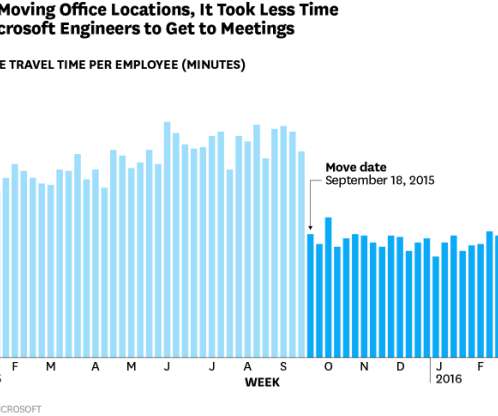
I see reports, dashboards, presentations with wide gaps. If you pause and consider how this data is collected, via a small triple digit sample self-reported survey results, you’ll quickly realize that the error range in this data is likely a few points. Experiment with visualization options, even in Excel! Why have two fat bars?


Let's personalize your content