Remove 2017 Remove Blog Remove Snapshot Remove Visualization
article thumbnail

Chart Snapshot: Alluvial Diagrams + Examples

The Data Visualisation Catalogue

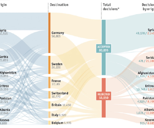
Seeking safety, European asylum application flows: acceptances and rejections The Economist PANTHEON: Corriere della Sera, La Lettura #181 Valerio Pellegrini G07: Environmental Migration DensityDesign Lab 2017 Lebanese Election Law Ahmad Barclay The post Chart Snapshot: Alluvial Diagrams + Examples appeared first on The Data Visualisation Catalogue (..)

article thumbnail

Can we identify 3-D images using very little training data?

Insight

In this blog, I’ll illustrate an approach by walking you through my project during my Data Science Fellowship at Insight , followed by a quick discussion pertaining to broader application. In order to solve this doubly challenging problem in a limited time frame, I opted to work with 2-D projections and snapshots of the 3-D images.

Insiders

Sign Up for our Newsletter

This site is protected by reCAPTCHA and the Google Privacy Policy and Terms of Service apply.

Trending Sources

article thumbnail

Chart Snapshot: Variable Width Bar Charts

The Data Visualisation Catalogue

Here’s how far we have to go — The Washington Post In almost all countries men smoke more than women Visualizing The Smoking Population of Countries — Visual Capitalist The post Chart Snapshot: Variable Width Bar Charts appeared first on The Data Visualisation Catalogue Blog.

article thumbnail

Don’t Start from Scratch! Make One of these Dashboards Instead

Depict Data Studio

Grant Deliverables In this blog post , you’ll see how Josephine Engels did need to start from scratch — she was visualizing these metrics for her organization for the first time — and then made several dashboards to track grant deliverables. No need to start from scratch. Adapt one of these dashboards instead.

article thumbnail

What is Data Visualisation? Why we do it?

Data Insight

Data visualisation is the representation of information or data in a visual or graphical form. In fact, 3M did some research and found that humans interpret visuals 60,000 times faster than text or data. Today the most powerful mediums are still visual, TV, movies and advertisement. Data visualisation IS NOT data storytelling.

IT 58
article thumbnail

What Is Data Intelligence?

Alation

HBR Review May/June 2017. BI leverages and synthesizes data from analytics, data mining, and visualization tools to deliver quick snapshots of business health to key stakeholders, and empower those people to make better choices. Subscribe to Alation's Blog. Source: “What’s Your Data Strategy?” Data curation. Data privacy.