article thumbnail

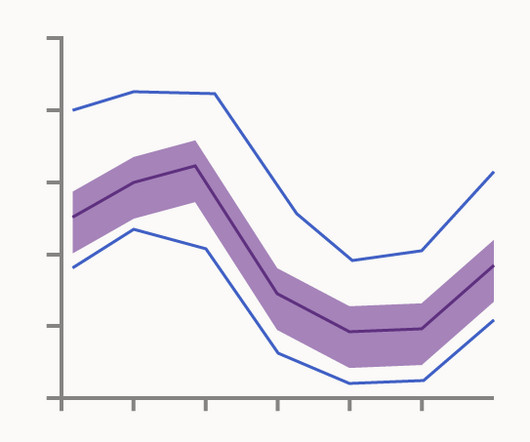
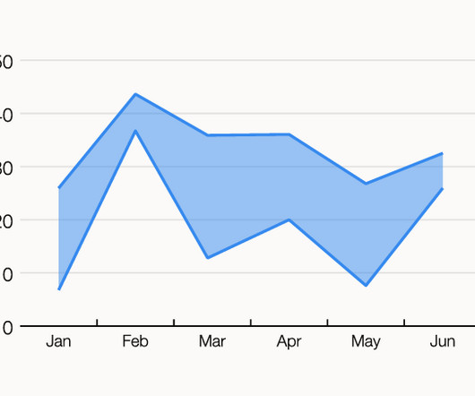
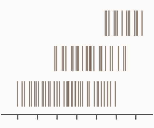
Chart Snapshot: Functional Box Plots

The Data Visualisation Catalogue

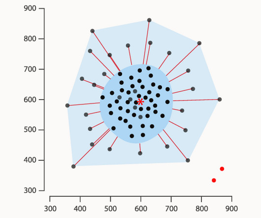
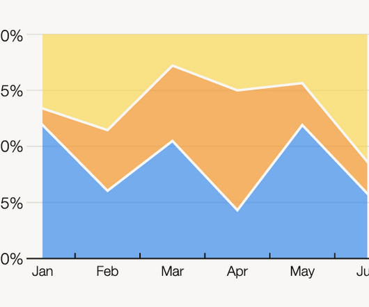
While this visualisation technique is a variation of the classic Box Plot , a Functional Box Plot is visually very different and instead plots a combination of lines and areas to communicate the various data ranges. The key features of a Functional Box Plot includes: Data Ordering: The functional data (e.g. and Genton, M.G., and Genton, M.G.,

Snapshot 101
article thumbnail

Chart Snapshot: Beanplots

The Data Visualisation Catalogue

Beanplot: A Boxplot Alternative for Visual Comparison of Distributions, Peter Kampstra Figure 4: An asymmetric beanplot of the singers. Beanplot: A Boxplot Alternative for Visual Comparison of Distributions, Peter Kampstra Party identification of respondent. statsmodels Figure 1-5: Beanplot of Years by picture group.

Insiders

Sign Up for our Newsletter

This site is protected by reCAPTCHA and the Google Privacy Policy and Terms of Service apply.

article thumbnail

Chart Snapshot: Triangle Bar Charts

The Data Visualisation Catalogue

While the Triangle Bar Chart offers a visually distinct way to represent categorical data, there are some considerations to keep in mind. The Visual Agency Related posts: Further Exploration #11: Bar/Column Chart Variations The post Chart Snapshot: Triangle Bar Charts appeared first on The Data Visualisation Catalogue Blog.

article thumbnail

Chart Snapshot: Curved Bar Charts

The Data Visualisation Catalogue

A Curved Bar Chart is a visually dynamic twist on the traditional Bar Chart. This chart is novel in its aesthetic but is flawed because of its potential for confusion and lack of visual precision compared to conventional bar charts. Also known as a Curved Column Chart.

article thumbnail

Chart Snapshot: Radar Box Plots

The Data Visualisation Catalogue

Tools to generate this chart: Python R Examples Wine Quality radarBoxplot-R on Github — Caio Hamamura The post Chart Snapshot: Radar Box Plots appeared first on The Data Visualisation Catalogue Blog.

article thumbnail

Chart Snapshot: Area Bands

The Data Visualisation Catalogue

Area Bands enhance standard Line Graphs by filling the space between upper and lower value lines with a shaded area, providing a visual representation of the range boundaries. Essentially, this is a visual enhancement to a graph, which offers more detail and context to data changing over time.

article thumbnail

Chart Snapshot: Bagplots

The Data Visualisation Catalogue

It provides a visual delineation of the main body of the data, illustrating its shape and arrangement within the dataset. Outliers can represented as asterisks or are highlighted with red or another bright colour to make them visually more detectable.