Remove Advertising Remove Key Performance Indicator Remove Optimization Remove Slice and Dice
article thumbnail

It's Not The Ink, It's The Think: 6 Effective Data Visualization Strategies

Occam's Razor

Too many bars, inside them too many slices, odd color choices, all end up with this question: what the heck's going on here? It also forces a lot less think than might be optimal. We throw off a lot of data as a subtle way of earning a great job performance review. Everything seems sub-optimal. Interesting trend.

article thumbnail

12 Marketing Reports Examples You Can Use For Annual, Monthly, Weekly And Daily Reporting Practice

datapine

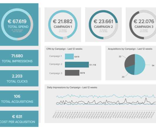
Using the right marketing KPIs (key performance indicators) is a good start – what is now left is finding a way to organize it all in a way that makes sense and brings value. It shows how targets are performing in a monthly view, but the user can easily set this marketing dashboard to a yearly time frame.

Reporting 280
Insiders

Sign Up for our Newsletter

This site is protected by reCAPTCHA and the Google Privacy Policy and Terms of Service apply.

Trending Sources

article thumbnail

Digital Dashboards: Strategic & Tactical: Best Practices, Tips, Examples

Occam's Razor

You need access to data, the ability to analyze (slice, dice, drill-up, drill-down, drill-around) interesting data points that your performance throws up, ability to understand what caused the performance (often by understanding who did, what and where in other parts of the organization), and the power to make decisions.

article thumbnail

Great Storytelling With Data: Visualize Simply And Focus Obsessively

Occam's Razor

The Directors, the Marketers, the Optimization employees and our resident social media gurus. You can cut yourself with it and embarrass yourself, or you can look the very best you ever have by using it optimally. We still live in an world where we are optimize for single visit sessions. No, you are smarter than that.