
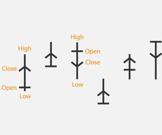
Chart Snapshot: Anchor Chart + Example
The Data Visualisation Catalogue
JANUARY 21, 2024
Mentioned in Steve Nison’s book Beyond Candlesticks (1994) on page 17, Exhibit 2.2. Related posts: Japanese Contributions to Data Visualisation The post Chart Snapshot: Anchor Chart + Example appeared first on The Data Visualisation Catalogue Blog. Said to have originated in Japan during the Kyoho Era (from 1716) from rice trades.


Let's personalize your content