Remove category power-bi
article thumbnail

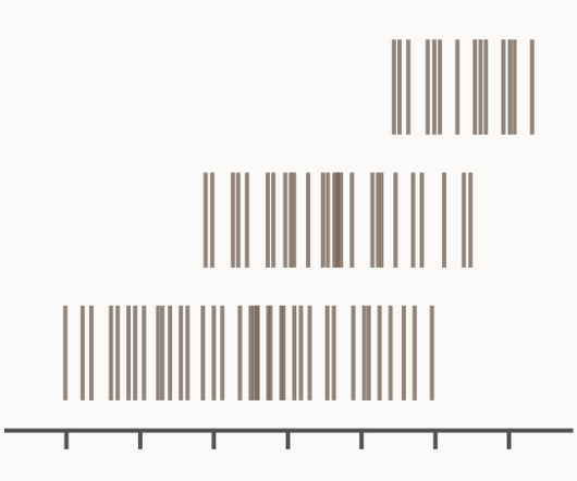
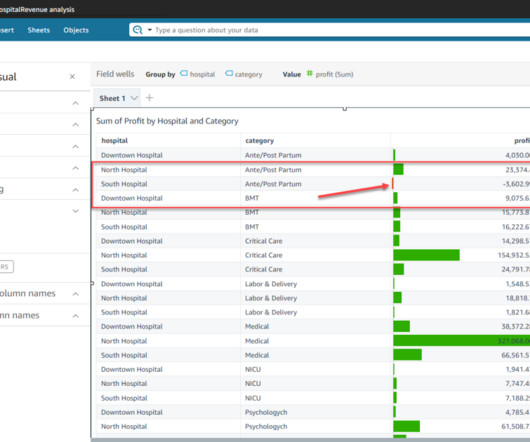
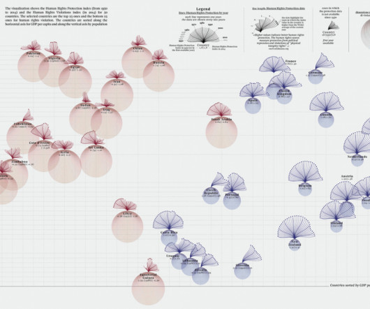
Chart Snapshot: Barcode Plot

The Data Visualisation Catalogue

A Barcode Plot is a chart used to visualise the data distribution across multiple categories by plotting short stripes along an axis. There are two main kind of Barcode Plot: first, the kind that plots a series of “barcodes” to compare the distributions between various categories across a single dimension.

article thumbnail

Understanding Data Drill Down And Drill Through Analysis And Their Role In Efficient Reporting

datapine

With this thought in mind, BI tools develop multiple solutions to assist businesses in dealing with their information in the most efficient way possible. Try our professional BI reporting software for 14 days, completely free! Drill down and drill throughs are two powerful features of BI reporting tools.

Reporting 173
Insiders

Sign Up for our Newsletter

This site is protected by reCAPTCHA and the Google Privacy Policy and Terms of Service apply.

article thumbnail

Move Beyond Excel, PowerPoint And Static Business Reporting with Powerful Interactive Dashboards

datapine

Take a comfortable seat, enjoy the power of interactive business dashboards , leave your spreadsheets behind, and utilize the advantages of interactive dashboard design and its features. Real-time dashboards enable real-time data and that is the beauty and power of business intelligence at its core.

article thumbnail

A Complete Guide To Bar Charts With Examples, Benefits, And Different Types 

datapine

2) Pros & Cons Of Bar Charts 3) When To Use A Bar Graph 4) Types Of Bar Charts 5) Bar Graphs & Charts Best Practices 6) Bar Chart Examples In today’s fast-paced analytical landscape, data visualization has become one of the most powerful tools organizations can benefit from to be successful with their analytical efforts.

article thumbnail

What Is The Difference Between Business Intelligence And Analytics?

datapine

2) BI vs BA As Seen Through Football. 3) BI And BA Main Differences. 4) How Do BI And BA Apply To Business? 5) BI And BA Use-Case Scenarios. 6) BI And BA Examples. Try our professional BI and analytics software for 14 days free! BI is looking in the rearview mirror and using historical data.

article thumbnail

Octopai Adds Support for DAX Coverage for SSRS

Octopai

Octopai has recently expanded its offerings by introducing unique and comprehensive DAX (Data Analysis Expressions) coverage support for Power BI, SSRS (SQL Server Reporting Services), and Tabular Analysis Services. This is where Octopai’s DAX support for Power BI and SSRS becomes essential.

Sales 78
article thumbnail

Understanding The Value Of Column Charts With Examples & Templates 

datapine

We already dived into professional gauge charts and bar charts , now it’s time to explore the power of column graphs. For example, in a business context, you can use one to compare sales by product category, specific products, or even sales representatives. They should be avoided when you are dealing with multiple categories.