Remove Definition Remove Key Performance Indicator Remove Slice and Dice Remove Visualization
article thumbnail

Great Storytelling With Data: Visualize Simply And Focus Obsessively

Occam's Razor

Avoid complex visualizations – they get in the way! Make performance comparisons easier! My goal is that you'll learn a set of filters you'll use as you think about the best ways to create your stories, however you choose to tell them with whatever visual output you most love. A delightful mess. Teddy ready?

article thumbnail

Digital Dashboards: Strategic & Tactical: Best Practices, Tips, Examples

Occam's Razor

Allow me to visualize the problem above, and leverage that visualization to present the solution. As you might have guessed, you are at the very right of the above visual, with most access to data, the ability to analyze it ( inshallah! ) Hence your CXOs should definitely not get a data puke like the one above.

Insiders

Sign Up for our Newsletter

This site is protected by reCAPTCHA and the Google Privacy Policy and Terms of Service apply.

article thumbnail

Move Beyond Excel, PowerPoint And Static Business Reporting with Powerful Interactive Dashboards

datapine

Visualizing the data and interacting on a single screen is no longer a luxury but a business necessity. They enable you to easily visualize your data, filter on-demand, and slice and dice your data to dig deeper. Maps are important data visualizations and at datapine, we love utilizing them in our dashboards.

article thumbnail

12 Marketing Reports Examples You Can Use For Annual, Monthly, Weekly And Daily Reporting Practice

datapine

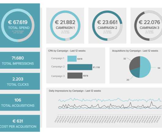
Using the right marketing KPIs (key performance indicators) is a good start – what is now left is finding a way to organize it all in a way that makes sense and brings value. But first, we will start with a basic definition and some tips on creating these kinds of reports. How do you know that? Let’s dig deeper.

Reporting 280
article thumbnail

Empowering Analysis Ninjas? 12 Signs To Identify A Data Driven Culture

Occam's Razor

7: 25% of all analytical effort is dedicated to data visualization/enhancing data's communicative power. #6: Before we go too deep, let's get a couple of definitions right first. Pick hard metrics to designate as your key performance indicators. . #9: Your qualitative analysis practice rocks like crazy!

article thumbnail

What Is Embedded Analytics?

Jet Global

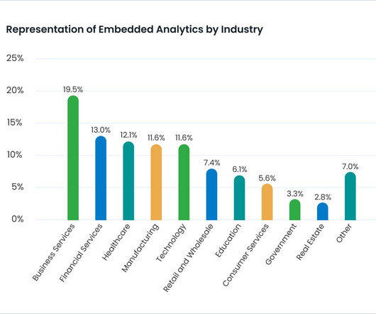
Introduction Why should I read the definitive guide to embedded analytics? The Definitive Guide to Embedded Analytics is designed to answer any and all questions you have about the topic. Plus, there is an expectation that tools be visually appealing to boot. Their dashboards were visually stunning.