article thumbnail

How to Use Data Visualization in Infographics?

Analytics Vidhya

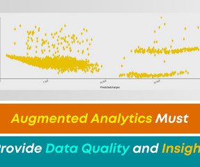
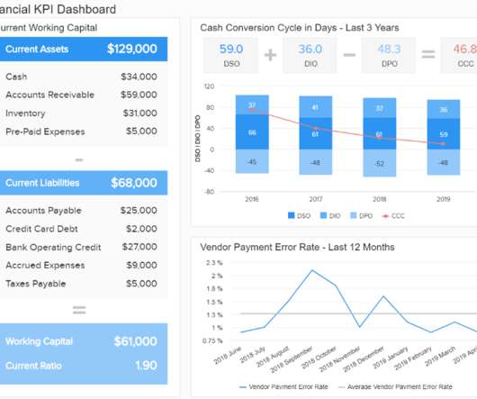
Data visualization in infographics is a dynamic way to do so. This article delves into data visualization within infographics and showcases ways to present information both aesthetically and comprehensively. What is Data Visualization?

article thumbnail

How to Plot Heatmaps in Seaborn?

Analytics Vidhya

Introduction Within the domain of data visualization, heatmaps distinguish themselves for their adeptness in portraying intricate data sets in a visually intuitive manner. This article discusses the nuances of crafting and tailoring […] The post How to Plot Heatmaps in Seaborn?

Insiders

Sign Up for our Newsletter

This site is protected by reCAPTCHA and the Google Privacy Policy and Terms of Service apply.

article thumbnail

How to Visualize Confidence Intervals in Presentation Slides

Depict Data Studio

Do you need to share statistics in presentations? We wanted to make a presentation-ready version. If you work in public health, then you know that the tiny text and statistical terminology is pretty common in scientific graphs. The Bottom Line We don’t have to delete or dumb-down our statistical graphs.

article thumbnail

Remove Your Rose Tinted Glasses: Data Visualizations Designed to Mislead

datapine

1) Misleading Data Visualization Examples. 2) How to Avoid Misleading Visuals. 3) The Impact Of Bad Data Visualizations. But while that may be the case, people are duped by data visualizations every day. Bad data visualizations come in many forms, with some more obvious than others. Table of Contents.

article thumbnail

Master Data Visualization Techniques: A Comprehensive Guide

FineReport

Data visualization techniques are paramount in today’s data-driven world. Mastering data visualization techniques is not just a skill but a necessity for professionals across various industries. Definition and Importance Visualizing data involves representing information through graphical elements like charts and graphs.

article thumbnail

Creating a Powerful Presentation: 3 Easy Changes to Revamp your PowerPoint

Depict Data Studio

Written into nearly every one of our grant projects is an objective to disseminate the project findings: This means presentations! So, with the impending conference season, I signed up for her Powerful Presentations course. Over the past few years, I have given a number of presentations across the country. The Before Times.

article thumbnail

From Raw Data to Visualization: Marvel Social Graph Analysis

Smart Data Collective

What’s amazing is that Marvel characters are developed through the influence of other Marvel heroes through data visualization. For instance, when Spider-Man appears in a comic book with Captain America, these are all visualized through data graphics. First Graphic Presentation. Then, together with sigma.js Shaping the Graph.