article thumbnail

Chart Snapshot: Box-Percentile Plots

The Data Visualisation Catalogue

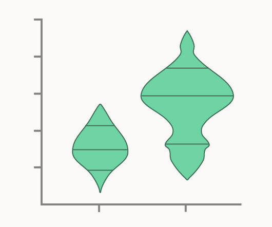
Box-Percentile Plots display the same summary statistics as regular Box Plots (median, quartiles, minimum, and maximum), but instead use line markers on a density/distribution shape to indicate their location. i17 Box-percentile plots of height-for-age (HAZ) by country; 2009-10. The Box-Percentile Plot, Warren W. Esty and Jeffrey D.

article thumbnail

Smarten Augmented Analytics Receives CERT-IN Certification for Its Products and Services!

Smarten

” The Information Technology Amendment Act of 2009 designated CERT-IN as the national agency to perform functions for cyber security, including the collection, analysis and dissemination of information on cyber incidents, as well as taking emergency measures to handle incidents and coordinating cyber incident response activities.

Insiders

Sign Up for our Newsletter

This site is protected by reCAPTCHA and the Google Privacy Policy and Terms of Service apply.

Trending Sources

article thumbnail

Fitting Support Vector Machines via Quadratic Programming

Domino Data Lab

The intuition here is that a decision boundary that leaves a wider margin between the classes generalises better, which leads us to the key property of support vector machines — they construct a hyperplane in a such a way that the margin of separation between the two classes is maximised (Haykin, 2009). Derivation of a Linear SVM. Fisher, R.

article thumbnail

New Edition of “Now You See It”

Perceptual Edge

On April 15, 2021, my book Now You See It (2009) will become available in its second edition with the revised subtitle An Introduction to Visual Data Sensemaking. Now You See It: An Introduction to Visual Data Sensemaking. Now You See It teaches the concepts, principles, and practices of visual data sensemaking.

IT 84
article thumbnail

Fitting Bayesian structural time series with the bsts R package

The Unofficial Google Data Science Blog

SCOTT Time series data are everywhere, but time series modeling is a fairly specialized area within statistics and data science. They may contain parameters in the statistical sense, but often they simply contain strategically placed 0's and 1's indicating which bits of $alpha_t$ are relevant for a particular computation. by STEVEN L.

article thumbnail

Themes and Conferences per Pacoid, Episode 9

Domino Data Lab

On the other hand, as Lipton emphasized, while the tooling produces interesting visualizations, visualizations do not imply interpretation. ML model interpretability and data visualization. From my experiences leading data teams, when a business is facing difficult challenges, data visualizations can help or hurt.

article thumbnail

Attributing a deep network’s prediction to its input features

The Unofficial Google Data Science Blog

Typically, causal inference in data science is framed in probabilistic terms, where there is statistical uncertainty in the outcomes as well as model uncertainty about the true causal mechanism connecting inputs and outputs. A note on visualization The most convenient way to inspect our feature importances (attributions) is to visualize them.

IT 68