article thumbnail

Bagaimana Pemula Dapat Membuat Dashboard yang Keren?

FineReport

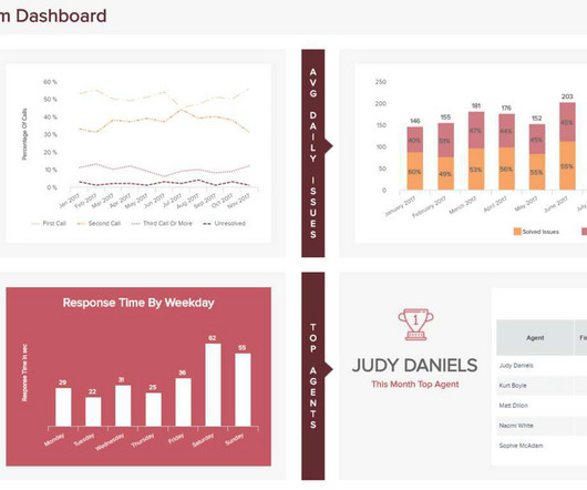
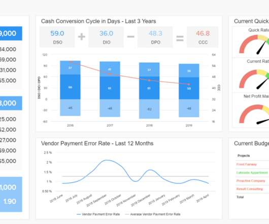
Dalam tren big data saat ini, visualisasi data telah menjadi mode tampilan interaktif yang dikagumi semua orang dan dashboard banyak digunakan untuk menampilkan kinerja bisnis di perusahaan. Jadi bagaimana caranya membuat dashboard yang baik, terutama untuk pemula? Sekarang, mari kita mulai! Tampilan efek.

article thumbnail

SSIS Catalog Dashboard

Tim Mitchell

For organizations using SQL Server 2012 and newer, the SSIS catalog is the ideal tool for storing, executing, and monitoring ETL logic. The SSIS catalog includes built-in reports that show execution activity for current and historical operations. The post SSIS Catalog Dashboard appeared first on Tim Mitchell.

Insiders

Sign Up for our Newsletter

This site is protected by reCAPTCHA and the Google Privacy Policy and Terms of Service apply.

article thumbnail

Bagaimana Cara Membuat Dashboard yang Keren?

FineReport

Kita dapat melakukan ini melalui layout dashboard dari satu laporan atau beberapa laporan, atau layout halaman dari beberapa laporan. Jadi bagaimana caranya merancang sebuah dashboard yang keren? Tapi untuk pemula dalam analisis data, bagaimana kita membuat dashboard keren kepunyaan kita sendiri? Kriteria di atas lebih umum.

article thumbnail

Designing Visual Appendices for Your Next Report—In Under an Hour

Depict Data Studio

A couple years ago, I worked on this report: This report summarized survey responses from both universities and their students. Even with hundreds of survey responses and dozens of survey questions, we kept the report’s body to just six pages! How’d we choose which findings to include in the report’s main body?!

article thumbnail

NHL turns to venue metrics data to drive sustainability

CIO Business Intelligence

In October, the league, with partner SAP, launched NHL Venue Metrics, a sustainability platform that teams and their venue partners can use for data collection, validation, and reporting and insights. IT-driven sustainability The league released sustainability reports in 2014 and 2018.

Metrics 144
article thumbnail

A Guide To The Methods, Benefits & Problems of The Interpretation of Data

datapine

6) The Use of Dashboards For Data Interpretation. In fact, a Digital Universe study found that the total data supply in 2012 was 2.8 Business dashboards are the digital age tools for big data. After its implementation in 2012, Intel saved over $3 million in manufacturing costs. trillion gigabytes!

article thumbnail

Introduction To The Basic Business Intelligence Concepts

datapine

A host of business intelligence concepts are executed through intuitive, interactive tools and dashboards – a centralized space that provides the ability to drill down into your data with ease. Data dashboarding and reporting. 4) Data dashboarding and reporting. But more on that later. followed by 18 zeros.