Remove 2014 Remove Optimization Remove Statistics Remove Visualization
article thumbnail

Towards optimal experimentation in online systems

The Unofficial Google Data Science Blog

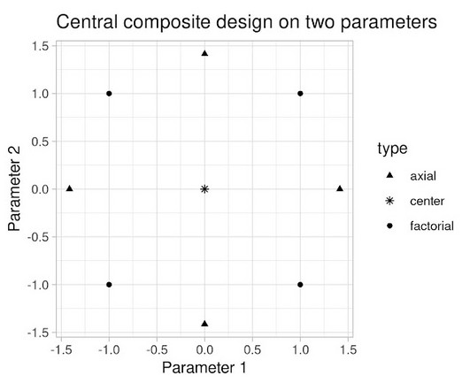
If $Y$ at that point is (statistically and practically) significantly better than our current operating point, and that point is deemed acceptable, we update the system parameters to this better value. In isolation, the $x_1$-system is optimal: changing $x_1$ and leaving the $x_2$ at 0 will decrease system performance.

article thumbnail

Designing Charts and Graphs: How to Choose the Right Data Visualization Types

datapine

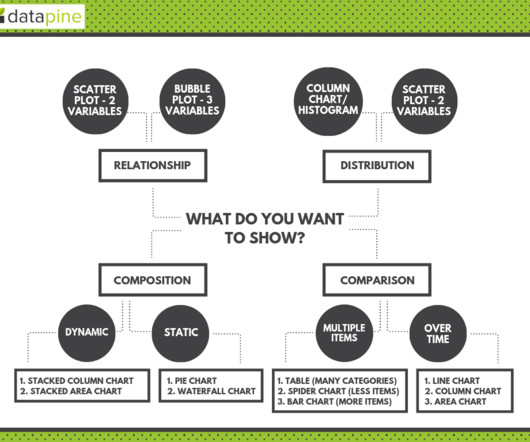
Modern dashboard software makes it simpler than ever to merge and visualize data in a way that’s as inspiring as it is accessible. Knowing what story you want to tell (analyzing the data) tells you which data visualization type to use. Let’s assume you have the right data and the right data visualization software. Distribution.

Insiders

Sign Up for our Newsletter

This site is protected by reCAPTCHA and the Google Privacy Policy and Terms of Service apply.

Trending Sources

article thumbnail

Optimizing clinical trial site performance: A focus on three AI capabilities

IBM Big Data Hub

Embracing AI for clinical trials: The elements of success By embracing three AI-enabled capabilities, biopharma companies can significantly optimize clinical trial site selection process while developing core AI competencies that can be scaled out and saving financial resources that can be reinvested or redirected.

article thumbnail

Discover 20 Essential Types Of Graphs And Charts And When To Use Them

datapine

2) Charts And Graphs Categories 3) 20 Different Types Of Graphs And Charts 4) How To Choose The Right Chart Type Data and statistics are all around us. That said, there is still a lack of charting literacy due to the wide range of visuals available to us and the misuse of statistics. Let’s dive into them.

article thumbnail

Great Storytelling With Data: Visualize Simply And Focus Obsessively

Occam's Razor

The Directors, the Marketers, the Optimization employees and our resident social media gurus. You can cut yourself with it and embarrass yourself, or you can look the very best you ever have by using it optimally. Avoid complex visualizations – they get in the way! Avoid complex visualizations – they get in the way!

article thumbnail

What is DataOps? Principles and Benefits

Octopai

Your dashboards, charts, visualizations… they’re all products. . The term “DataOps” was coined by Lenny Leibman in 2014, both on his own blog and in a well-publicized (but no longer extant) article on the IBM Big Data & Analytics Hub. Just-in-Time” manufacturing increases production while optimizing resources.

article thumbnail

Fitting Bayesian structural time series with the bsts R package

The Unofficial Google Data Science Blog

SCOTT Time series data are everywhere, but time series modeling is a fairly specialized area within statistics and data science. They may contain parameters in the statistical sense, but often they simply contain strategically placed 0's and 1's indicating which bits of $alpha_t$ are relevant for a particular computation. by STEVEN L.