article thumbnail

Top Productivity Metrics Examples & KPIs To Measure Performance And Outcomes

datapine

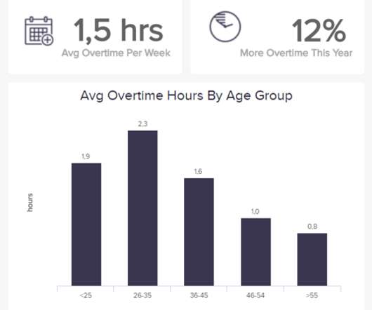
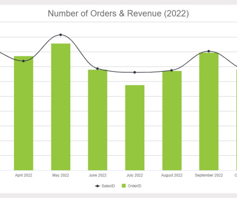
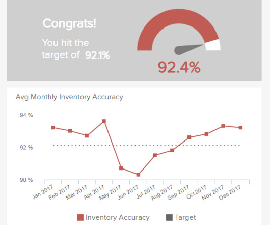
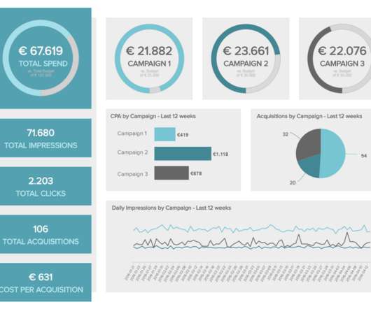
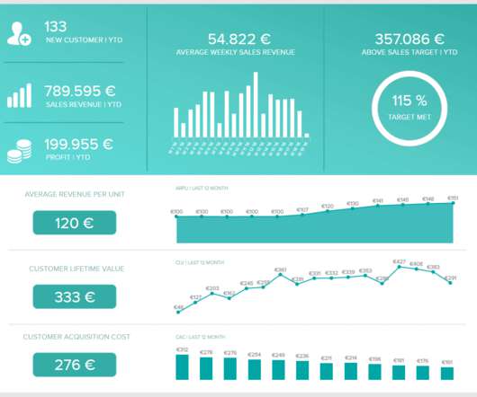
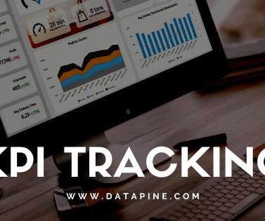
2) How To Measure Productivity? For years, businesses have experimented and narrowed down the most effective measurements for productivity. Use our 14-day free trial and start measuring your productivity today! In shorter words, productivity is the effectiveness of output; metrics are methods of measurement.

article thumbnail

Take Advantage Of The Best Interactive & Effective Data Visualization Examples

datapine

Table of Contents 1) The Benefits Of Data Visualization 2) Our Top 27 Best Data Visualizations 3) Interactive Data Visualization: What’s In It For Me? 4) Static vs. Animated Data Visualization Data is the new oil? ” – David McCandless Humans are visual creatures. This very notion is the core of visualization.

Insiders

Sign Up for our Newsletter

This site is protected by reCAPTCHA and the Google Privacy Policy and Terms of Service apply.

Trending Sources

article thumbnail

Remove Your Rose Tinted Glasses: Data Visualizations Designed to Mislead

datapine

1) Misleading Data Visualization Examples. 2) How to Avoid Misleading Visuals. 3) The Impact Of Bad Data Visualizations. But while that may be the case, people are duped by data visualizations every day. Bad data visualizations come in many forms, with some more obvious than others. Table of Contents.

article thumbnail

The Top 20 Data Visualization Books That Should Be On Your Bookshelf

datapine

Now that you’re sold on the power of data analytics in addition to data-driven BI, it’s time to take your journey a step further by exploring how to effectively communicate vital metrics and insights in a concise, inspiring, and accessible format through the power of visualization. That’s a colossal number of books on visualization.

article thumbnail

13 Essential Data Visualization Techniques, Concepts & Methods To Improve Your Business – Fast

datapine

“By visualizing information, we turn it into a landscape that you can explore with your eyes. 90% of the information transmitted to the brain is visual. Data visualization methods refer to the creation of graphical representations of information. That’s where data visualization comes in. A sort of information map.

article thumbnail

Improved CPU throttling measurement

IBM Big Data Hub

As illustrated in our first blog post , setting the wrong CPU limit is silently killing your application performance and literally working as designed. Turbonomic visualizes throttling metrics and, more importantly, takes throttling into consideration when recommending CPU limit sizing. core (or 400m).

article thumbnail

Why Do You Need To Visualize Your Accounting Reports?

datapine

5) The Role Of Visuals In Accountant Reports. It is useful to measure the financial reserves and liquidity of a business. To do so, however, you need several tools: a good accounting software, but also a solid online data visualization tool. Table of Contents. 1) What Are Accounting Reports? 3) Types Of Accounting Reports.