Remove waterfall-charts
article thumbnail

How to use waterfall charts?

Daydreaming Numbers

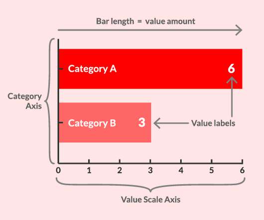
A waterfall chart is used to show how an initial value is increased and/or decreased by a series of intermediate values, leading to a final value. The post How to use waterfall charts? appeared first on Daydreaming Numbers.

40
article thumbnail

New Format for The Bar Chart Reference Page

The Data Visualisation Catalogue

To demonstrate the potential new content structure being implemented on an existing visualisation reference page, here’s an example provided for Bar Charts : Bar Chart. When the bars are horizontal, it’s known as a ‘Bar Chart’ , while when the bars are vertical it’s known as a ‘Column Chart’. Column Chart.

Insiders

Sign Up for our Newsletter

This site is protected by reCAPTCHA and the Google Privacy Policy and Terms of Service apply.

article thumbnail

How to Make Great Graphs in Excel: 4 Levels of Excel Vizardry

Depict Data Studio

Nowadays, I teach Excel dataviz based on the degree of behind-the-scenes hacking needed to produce that chart. Level 5 would be adapting those charts for specific contexts, like for interactive dashboards. These miniature charts help us spot key patterns instantly. Formatting Needed Stacked bar charts, for example.

article thumbnail

Why You’re Not Ready for Knowledge Graphs!

Ontotext

In fact, we had one executive at a client who was probably a few weeks into the project, when we realized that when we said “graph,” they thought we meant “charts”. Delivery methods Sometimes organizations are stuck in a battle between traditional “waterfall” and modern “agile” methods. So, we’ve learned our lesson.

article thumbnail

How to Create a Performance Dashboard in 10-Mins?

FineReport

Setup spreadsheets & charts. One worksheet is for saving raw data, one worksheet is for saving chart data, that is, only the data that needs to be entered into the different charts of the dashboard, and the last one is the dashboard tab where the various charts will appear. Beautify, refine & repeat. Conclusion.

article thumbnail

Closing Data's Last-Mile Gap: Visualizing For Impact!

Occam's Razor

The bar chart is a sub-optimal way to let the audience see this. I applied the radar chart to this data, and got this lovely end result…. Two minutes later, you’ll have a little waterfall…. If you dislike waterfalls for some reason and prefer towers…. I like the waterfall, but this is not bad. :). I really do.

article thumbnail

Discover 20 Essential Types Of Graphs And Charts And When To Use Them

datapine

Table of Contents 1) What Are Graphs And Charts? 2) Charts And Graphs Categories 3) 20 Different Types Of Graphs And Charts 4) How To Choose The Right Chart Type Data and statistics are all around us. In many cases, even the chart designers are not picking the right visuals to convey the information in the correct way.