Remove dashboard-designer
article thumbnail

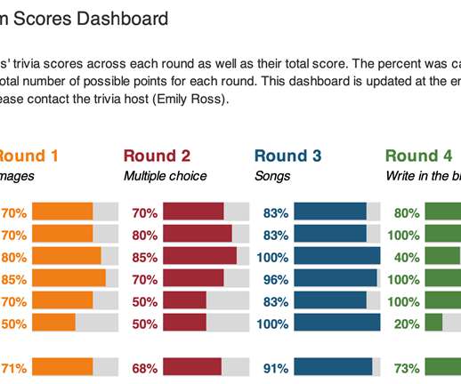
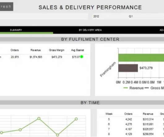
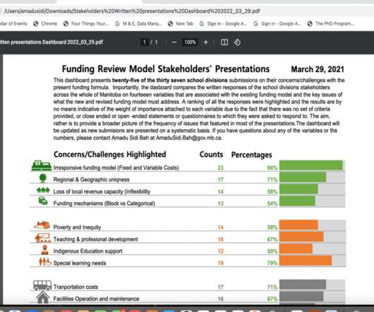
Best Dashboard Ideas & Design Examples To Boost Your Business Success

datapine

With so much data available to today’s brands and businesses, to extract every drop of value from an ever-growing raft of digital insights and set the kind of KPIs that will drive your venture forward, having an easy to use, a visually-stunning dashboard is key. Exclusive Bonus Content: 15 Powerful Dashboard Ideas: A Summary.

article thumbnail

Dashboard Design: Navigation To Better User Experience

FineReport

Dashboard is the core function of data products. Therefore, dashboard design, also called dashboard navigation, is very important for navigating users to better apply dashboards. Therefore, dashboard design, also called dashboard navigation, is very important for navigating users to better apply dashboards.

Insiders

Sign Up for our Newsletter

This site is protected by reCAPTCHA and the Google Privacy Policy and Terms of Service apply.

article thumbnail

Mobile Dashboard: A Complete Design Guide

FineReport

The mobile dashboard allows you to monitor the real-time business performance, check what is going on, query the business data anytime and anywhere. However, mobile dashboards are designed differently from regular dashboards because they need to fit on a small screen adaptively. The design of the mobile dashboard layout.

article thumbnail

Take Advantage Of Mobile Dashboards – Examples & Selected Designs

datapine

Mobile technology has changed the way we interact with the world around us, and when it comes to analyzing valuable business insights, mobile dashboards offer the freedom and flexibility to turn stats into success while you’re on the go. What Is A Mobile Dashboard? Why Are Mobile Dashboards Important?

article thumbnail

The Definitive Guide to Dashboard Design

Dashboard design can mean the difference between users excitedly embracing your product or ignoring it altogether. Great dashboards lead to richer user experiences and significant return on investment (ROI), while poorly designed dashboards distract users, suppress adoption, and can even tarnish your project or brand.

article thumbnail

Designing a Prettier and More Effective Dashboard with Excel

Depict Data Studio

She enrolled in our Dashboard Design course and is sharing how she uses her new skills in real life. —– Using a dashboard has been central to my work as a program evaluator. Even before taking Ann’s Dashboard Design course, I knew Excel was the smarter choice just for the ability to use formulas.

article thumbnail

The Easy Button for Dashboard Design

Juice Analytics

He’s an expert dashboard designer, adjunct professor at NYU , and hosts a deep-dive podcast with industry experts (and me). Lee recently shared a spot-on list of The 10 Tableau Dashboard Fixes You Need To Be An Analytics Hero. Long beforehand, we spent our time fixing Excel dashboards and PowerPoint slides to make them readable.

article thumbnail

7+ Graphics Libraries to Enhance Your Embedded Analytics

When your customers come to your app, what do they see: clunky, outdated dashboards or a sleek, modern interface? This e-book details a number of graphics libraries plus a few bonus tools to modernize your embedded dashboards.

article thumbnail

Analytics Best Practices: 5 Key Dashboard Design Principles

In this blog, we explore 5 key principles that exist to ensure you create a relevant dashboard that guides and simplifies the user experience, makes it as easy as possible to interpret what is presented no matter its complexity, and increases the adoption of BI.

article thumbnail

Add Value with a Dashboard Refresh: What You Need to Know

Speaker: Miles Robinson, Agile and Management Consultant, Motivational Speaker

Dashboards and analytics can really set your application apart, but that doesn't mean you can implement them and forget about them. Join Miles Robinson, former UX and Design Manager, as he explains the different ways to refresh your dashboards - and how to determine what's the best path to product dashboard success.