Remove Dashboards Remove Data Quality Remove Definition Remove Metrics
article thumbnail

The Ultimate Guide to Modern Data Quality Management (DQM) For An Effective Data Quality Control Driven by The Right Metrics

datapine

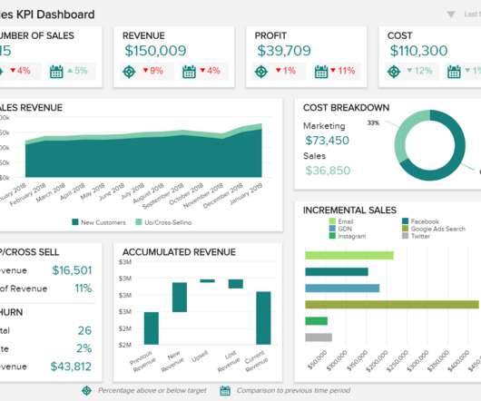
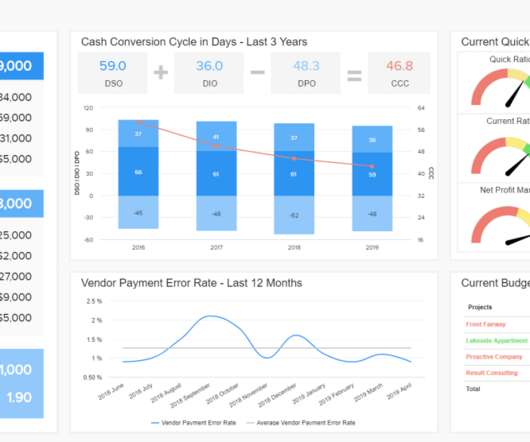
1) What Is Data Quality Management? 4) Data Quality Best Practices. 5) How Do You Measure Data Quality? 6) Data Quality Metrics Examples. 7) Data Quality Control: Use Case. 8) The Consequences Of Bad Data Quality. 9) 3 Sources Of Low-Quality Data.

article thumbnail

Visualize data quality scores and metrics generated by AWS Glue Data Quality

AWS Big Data

AWS Glue Data Quality allows you to measure and monitor the quality of data in your data repositories. It’s important for business users to be able to see quality scores and metrics to make confident business decisions and debug data quality issues.

Insiders

Sign Up for our Newsletter

This site is protected by reCAPTCHA and the Google Privacy Policy and Terms of Service apply.

article thumbnail

Financial Dashboard: Definition, Examples, and How-tos

FineReport

In today’s dynamic business environment, gaining comprehensive visibility into financial data is crucial for making informed decisions. This is where the significance of a financial dashboard shines through. What is A Financial Dashboard? You can download FineReport for free and have a try!

article thumbnail

SaaS Dashboard Examples For Modern Business Management Practices

datapine

If you’re part of a growing SaaS company and are looking to accelerate your success, leveraging the power of data is the way to gain a real competitive edge. That’s where SaaS dashboards enter the fold. A SaaS dashboard is a powerful business intelligence tool that offers a host of benefits for ambitious tech businesses.

article thumbnail

Data Quality vs Data Condition: The Power of Context

Anmut

Unfortunately, traditional approaches to data remediation often focus on technical data quality in isolation from the broader data and business ecosystem. In this blog post, we’ll compare traditional data quality vs data condition — the big picture approach to data improvement we use here at Anmut.

article thumbnail

5 surefire ways to derail a digital transformation (without knowing it)

CIO Business Intelligence

Worse is when prioritized initiatives don’t have a documented shared vision, including a definition of the customer, targeted value propositions, and achievable success criteria. But there are common pitfalls , such as selecting the wrong KPIs , monitoring too many metrics, or not addressing poor data quality.

article thumbnail

Take Advantage Of The Top 16 Sales Graphs And Charts To Boost Your Business

datapine

Because after all – a business dashboard is worth a thousand Excel sheets. A definitive sales graph example for any growing organization. A sales graph example generated with a dashboard builder that will prove invaluable regardless of your niche or sector. 11) Sales KPI Dashboard. How Do You Know Which Graph To Use?

Sales 235