Remove Dashboards Remove Data Transformation Remove Interactive Remove Visualization
article thumbnail

Unveiling the Top 10 Data Visualization Companies of 2024

FineReport

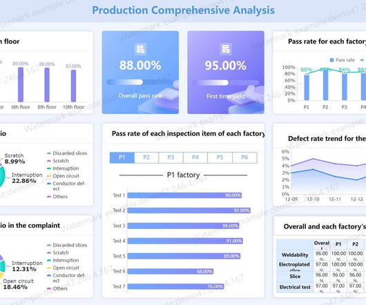
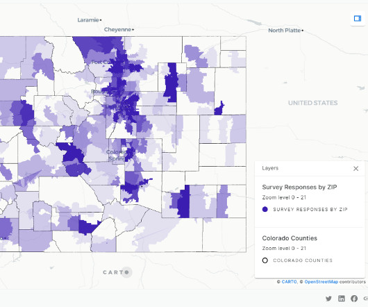
In 2024, data visualization companies play a pivotal role in transforming complex data into captivating narratives. This blog provides an insightful exploration of the leading entities shaping the data visualization landscape.

article thumbnail

Mastering Data Analysis Report and Dashboard

FineReport

As we explore examples of data analysis reports and interactive report data analysis dashboards, we embark on a journey to unravel the nuanced art of transforming raw data into meaningful narratives that empower decision-makers. Try FineReport Now 1. Try FineReport Now 1.1

Insiders

Sign Up for our Newsletter

This site is protected by reCAPTCHA and the Google Privacy Policy and Terms of Service apply.

Trending Sources

article thumbnail

How HR&A uses Amazon Redshift spatial analytics on Amazon Redshift Serverless to measure digital equity in states across the US

AWS Big Data

HR&A has used Amazon Redshift Serverless and CARTO to process survey findings more efficiently and create custom interactive dashboards to facilitate understanding of the results. Figure 1: Workflow illustrating data ingesting, transformation, and visualization using Redshift and CARTO.

article thumbnail

10 Examples of How Big Data in Logistics Can Transform The Supply Chain

datapine

The rise of SaaS business intelligence tools is answering that need, providing a dynamic vessel for presenting and interacting with essential insights in a way that is digestible and accessible. The future is bright for logistics companies that are willing to take advantage of big data.

Big Data 275
article thumbnail

The Ultimate Guide to Modern Data Quality Management (DQM) For An Effective Data Quality Control Driven by The Right Metrics

datapine

He/she assists the organization by providing clarity and insight into advanced data technology solutions. As quality issues are often highlighted with the use of dashboard software , the change manager plays an important role in the visualization of data quality. date, month, and year).

article thumbnail

Improve power utility operational efficiency using smart sensor data and Amazon QuickSight

AWS Big Data

QuickSight meets varying analytics needs with modern interactive dashboards, paginated reports, natural language queries, ML-insights, and embedded analytics, from one unified service. The AWS Glue Data Catalog contains the table definitions for the smart sensor data sources stored in the S3 buckets.

article thumbnail

Harnessing Streaming Data: Insights at the Speed of Life

Sisense

Upsolver encapsulates the streaming engineering complexity by empowering every technical user (data engineers, DBAs, analysts, scientists, developers) to ingest, discover, and prepare streaming data for analytics. The impact of implementing these best practices is faster queries that will power Redshift and dashboards in Sisense.