Remove Dashboards Remove Interactive Remove Metadata Remove Visualization
article thumbnail

Enhance monitoring and debugging for AWS Glue jobs using new job observability metrics, Part 3: Visualization and trend analysis using Amazon QuickSight

AWS Big Data

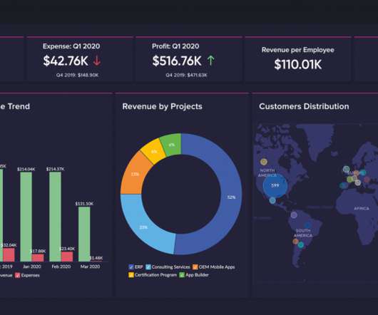
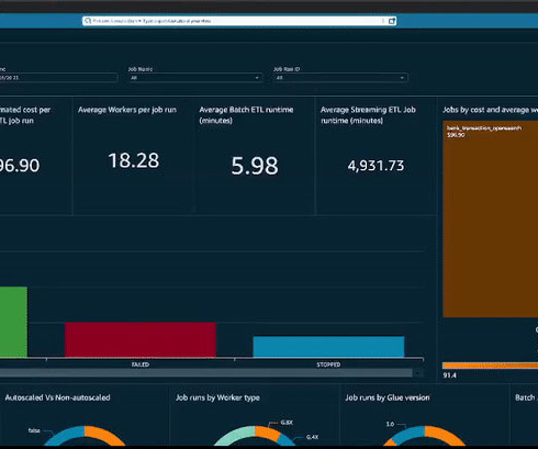
Grafana provides powerful customizable dashboards to view pipeline health. QuickSight makes it straightforward for business users to visualize data in interactive dashboards and reports. QuickSight makes it straightforward for business users to visualize data in interactive dashboards and reports.

Metrics 104
article thumbnail

How can CIOs safely unleash generative AI on their company’s data?

CIO Business Intelligence

However, people generally don’t know which graphs, charts, or visualizations to ask for or how to discover initial data to prepare data for their dashboards. GenBI can generate complex, dynamic visualizations that you can manipulate, zoom in and out, or continue investigating a particular subset of data.

Insiders

Sign Up for our Newsletter

This site is protected by reCAPTCHA and the Google Privacy Policy and Terms of Service apply.

article thumbnail

Visualize Amazon DynamoDB insights in Amazon QuickSight using the Amazon Athena DynamoDB connector and AWS Glue

AWS Big Data

These include internet-scale web and mobile applications, low-latency metadata stores, high-traffic retail websites, Internet of Things (IoT) and time series data, online gaming, and more. Athena is a serverless, interactive service that allows you to query data from a variety of sources in heterogeneous formats, with no provisioning effort.

article thumbnail

How HR&A uses Amazon Redshift spatial analytics on Amazon Redshift Serverless to measure digital equity in states across the US

AWS Big Data

HR&A has used Amazon Redshift Serverless and CARTO to process survey findings more efficiently and create custom interactive dashboards to facilitate understanding of the results. Figure 1: Workflow illustrating data ingesting, transformation, and visualization using Redshift and CARTO.

article thumbnail

The Ultimate Guide to Modern Data Quality Management (DQM) For An Effective Data Quality Control Driven by The Right Metrics

datapine

As quality issues are often highlighted with the use of dashboard software , the change manager plays an important role in the visualization of data quality. It involves: Reviewing data in detail Comparing and contrasting the data to its own metadata Running statistical models Data quality reports. 2 – Data profiling.

article thumbnail

How to get powerful and actionable insights from any and all of your data, without delay

Cloudera

By enabling their event analysts to monitor and analyze events in real time, as well as directly in their data visualization tool, and also rate and give feedback to the system interactively, they increased their data to insight productivity by a factor of 10. . Our solution: Cloudera Data Visualization.

article thumbnail

Microsoft Integration Made Easier with Alation’s New Power BI Scanner Connector

Alation

Support for Power BI on Azure and catalogs: workflow, apps, reports, dashboards, tiles, datasets, dataset fields. Full lineage support for Power BI objects (datasets, reports, tiles, dashboards). With the previous PBIX file-based implementation, there was both a lack of clarity and limit on which metadata is available.