
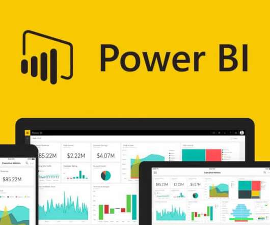
Building your First Power BI Report from Scratch
Analytics Vidhya
AUGUST 1, 2022
This article was published as a part of the Data Science Blogathon. What is equally important here is the ability to communicate the data and insights from your predictive models through reports and dashboards. The post Building your First Power BI Report from Scratch appeared first on Analytics Vidhya. And […].


Let's personalize your content