article thumbnail

Mastering Data Analysis Report and Dashboard

FineReport

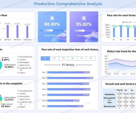
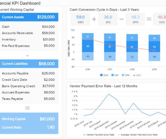
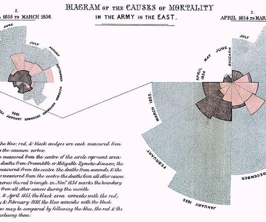
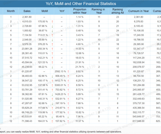
As we explore examples of data analysis reports and interactive report data analysis dashboards, we embark on a journey to unravel the nuanced art of transforming raw data into meaningful narratives that empower decision-makers. These reports distill viewpoints for guiding operations based on statistics, hotspots, and audience analysis.

article thumbnail

Mastering BI Dashboard Tools: Your Essential Guide

FineReport

In today’s data-driven landscape, businesses are leaning more on BI tools , particularly BI dashboard solutions, to enhance decision-making through data visualization. These BI Dashboard tools blend advanced analytics with user-friendly interfaces, revealing invaluable insights.

Insiders

Sign Up for our Newsletter

This site is protected by reCAPTCHA and the Google Privacy Policy and Terms of Service apply.

Trending Sources

article thumbnail

Get Started With Business Performance Dashboards – Examples & Templates

datapine

That said, if you’re looking to evolve your empire, increase brand awareness, and boost your bottom line, embracing business performance dashboards and big data should be at the top of your priority list. You need data-driven decisions, and a dashboard for business performance will make sure you reap the best possible rewards.

article thumbnail

What is IoT Dashboard?

FineReport

Among the tools that have emerged from this digital transformation, IoT dashboards stand out as invaluable assets. In this article, we will explore the concept of IoT dashboards, delve into their benefits, examine real-life examples, and highlight the essential features that make them indispensable in the IoT landscape.

IoT 52
article thumbnail

How to Make a Not-So-Scary Starter Dashboard in Excel

Depict Data Studio

Dashboards aren’t scary! In this video, let’s make a starter dashboard in Microsoft Excel. if we want each category in our dashboard to have its own color). They’re helpful for visualizing summary statistics like totals or averages. I use these visuals over and over in my real-life consulting projects. Watch the Tutorial.

article thumbnail

Why Nonprofits Shouldn’t Use Statistics

Depict Data Studio

— Thank you to Ann Emery, Depict Data Studio, and her Simple Spreadsheets class for inviting us to talk to them about the use of statistics in nonprofit program evaluation! But then we realized that much of the time, statistics just don’t have much of a role in nonprofit work. Why Nonprofits Shouldn’t Use Statistics.

article thumbnail

Integrating Python in Power BI: Get the best of both worlds

Analytics Vidhya

Overview A demonstration of statistical analytics by Integrating Python within Power BI Share the findings using dashboards and reports Introduction Power BI is. The post Integrating Python in Power BI: Get the best of both worlds appeared first on Analytics Vidhya.