article thumbnail

What is a KPI Report? Definition, Examples, and How-tos

FineReport

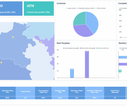
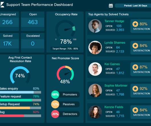
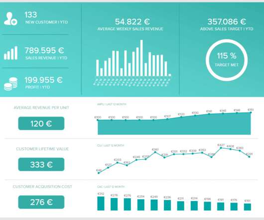
To effectively monitor and analyze these metrics, businesses utilize KPI reports. In this article, we will explore the concept of KPI reports, highlight their significance, provide examples and templates, discuss the essential components, and offer valuable insights on creating KPI reports efficiently.

KPI 52
article thumbnail

Why Dashboard Visualization Matters in the 21st century?

FineReport

Data dashboard visualization plays a key role in business, whether about analysis or decision. It empowers every user to understand complex data in a visual way. Now, let’s explore the dashboard visualization! What is Dashboard Visualization? dashboard visualization (by Finereport?. Just a link to their dashboards!

Insiders

Sign Up for our Newsletter

This site is protected by reCAPTCHA and the Google Privacy Policy and Terms of Service apply.

article thumbnail

Huabao sniffs out the ultimate efficiency formula

CIO Business Intelligence

Major finance and business information, along with sales and subcontracting documents, were processed manually and offline. Without visualized analytics, it was difficult to bridge the void between expectation and accurate analysis. Even as the Huabao Group expanded, its digitization effort lagged.

article thumbnail

An Introduction To Data Dashboards: Meaning, Definition & Industry Examples

datapine

Data dashboards provide a centralized, interactive means of monitoring, measuring, analyzing, and extracting a wealth of business insights from relevant datasets in several key areas while displaying aggregated information in a way that is both intuitive and visual. Lack of different data visualization types.

article thumbnail

Qlik’s most underrated capabilities

Jet Global

Users can create visual connections between different datasets spread across their network, creating deep insights that enable users to gain a full understanding of their data,” explained a reviewer on Peerspot. It’s easy to navigate around the software and doesn’t take much training to get a person to create their own data visualizations.

KPI 52
article thumbnail

Extend Power BI with Custom Visuals

Jet Global

As one of the most widely used data visualization tools in the world, Power BI has made some huge improvements to creating custom visualizations that we want to share with you. When creating or editing a Power BI dashboard, you have access to a ton of different types of visuals. Custom Visuals for Power BI.

article thumbnail

A Data-Driven Guide To Skyrocket Your Year Over Year Growth

datapine

Year over year growth is a KPI that allows you to measure and benchmark your progress against a comparison period of 12 months before. By documenting key patterns over set timeframes from one year to the next, you can understand how your company is performing on a consistent basis. What Is YoY Growth? Why Do You Need YoY Analysis?