Remove Document Remove Measurement Remove Metrics Remove Visualization
article thumbnail

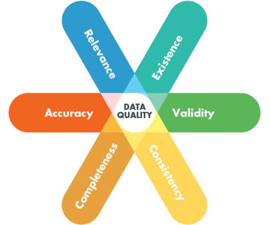
The Ultimate Guide to Modern Data Quality Management (DQM) For An Effective Data Quality Control Driven by The Right Metrics

datapine

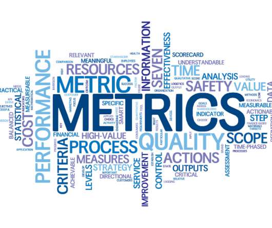
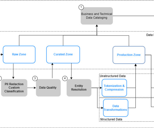
5) How Do You Measure Data Quality? 6) Data Quality Metrics Examples. In this article, we will detail everything which is at stake when we talk about DQM: why it is essential, how to measure data quality, the pillars of good quality management, and some data quality control techniques. Table of Contents. 2) Why Do You Need DQM?

article thumbnail

Deploy Amazon QuickSight dashboards to monitor AWS Glue ETL job metrics and set alarms

AWS Big Data

In this post, we explore how to combine AWS Glue usage information and metrics with centralized reporting and visualization using QuickSight. One federated query gathers AWS Glue metric data from Amazon CloudWatch metrics; the other gathers data from the DynamoDB table where Lambda writes the AWS Glue job metadata it’s collecting.

Metrics 85
Insiders

Sign Up for our Newsletter

This site is protected by reCAPTCHA and the Google Privacy Policy and Terms of Service apply.

article thumbnail

DirectX Visualization Optimizes Analytics Algorithmic Traders

Smart Data Collective

Learn how DirectX visualization can improve your study and assessment of different trading instruments for maximum productivity and profitability. Let’s dive right into how DirectX visualization can boost analytics and facilitate testing for you as an Algo-trader, quant fund manager, etc. But first, What is DirectX Anyway?

article thumbnail

A Data-Driven Guide To Skyrocket Your Year Over Year Growth

datapine

YoY growth is an effective means of measuring your ongoing progress and making sure your business is moving in the right direction. Here we’re going to look at the concept of YoY and consider how you can use this essential metric to your business-boosting advantage. That’s where year over year (YoY) growth enters the mix.

article thumbnail

Dashboard Metrics: Your KPI Guidelines and Practices

FineReport

Metrics dashboards enable you and your team to track the effectiveness of various tactics, campaigns, and processes. These KPI metrics are critical data to analyze and evaluate a company’s sales, human resources, and marketing, and operational activities. Dashboard metrics from FineReport. What is dashboard metrics.

KPI 52
article thumbnail

Designing Charts and Graphs: How to Choose the Right Data Visualization Types

datapine

Modern dashboard software makes it simpler than ever to merge and visualize data in a way that’s as inspiring as it is accessible. Knowing what story you want to tell (analyzing the data) tells you which data visualization type to use. Let’s assume you have the right data and the right data visualization software. Distribution.

article thumbnail

Try semantic search with the Amazon OpenSearch Service vector engine

AWS Big Data

Lexical search looks for words in the documents that appear in the queries. Background A search engine is a special kind of database, allowing you to store documents and data and then run queries to retrieve the most relevant ones. We’ll compare searching for visual similarity (on the left) and textual similarity (on the right).