
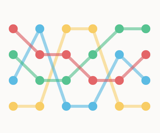
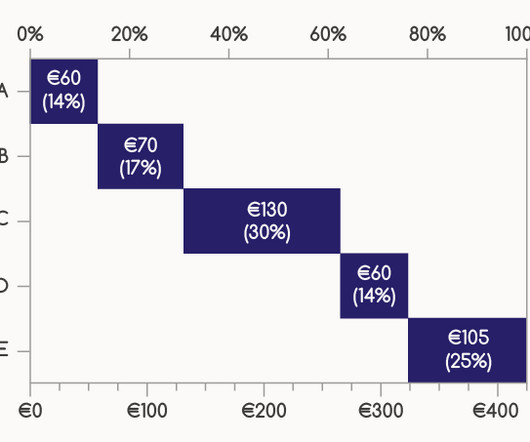
Chart Snapshot: Bump Charts
The Data Visualisation Catalogue
MAY 13, 2024
FLOWINGDATA / Nathan Yau The post Chart Snapshot: Bump Charts appeared first on The Data Visualisation Catalogue Blog. The connecting lines are usually straight, but curved line interpolation may be used to highlight a general trend rather than focusing on precise readings. Colour is often used to distinguish each category.


Let's personalize your content