article thumbnail

Know Your Data Ingredients

Juice Analytics

Metrics are the data values that measure performance. These are the ways you slice and dice your metrics. Format - How should the metric values be presented in your visuals? (3) The numbers you tend to aggregate or average. Dimensions are the data values that describe an attribute.

article thumbnail

The Complete Digital Analytics Ecosystem: How To Win Big

Occam's Razor

Even if you are in the super-jaded category, this will help you present something to your boss's boss that will get them to finally understand what you do! Helpful post: You Are What You Measure, So Choose Your KPIs (Incentives) Wisely! ]. You need to slice! You need to dice! Repeat after me: Slice, dice, drill!!

Analytics 150
Insiders

Sign Up for our Newsletter

This site is protected by reCAPTCHA and the Google Privacy Policy and Terms of Service apply.

article thumbnail

Measuring Validity and Reliability of Human Ratings

The Unofficial Google Data Science Blog

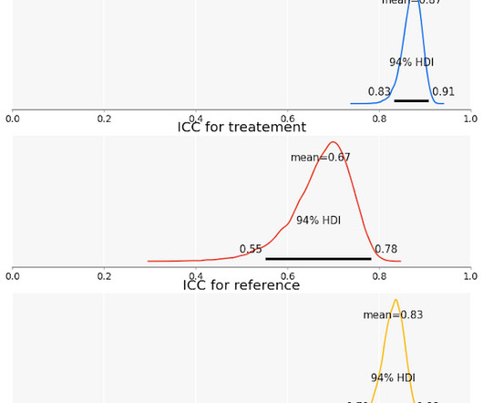
E ven after we account for disagreement, human ratings may not measure exactly what we want to measure. Researchers and practitioners have been using human-labeled data for many years, trying to understand all sorts of abstract concepts that we could not measure otherwise. That’s the focus of this blog post.

article thumbnail

It's Not The Ink, It's The Think: 6 Effective Data Visualization Strategies

Occam's Razor

I'm assuming for the rest of this post that either you are the person responsible for presenting the output of the analytical efforts OR you are working with a person who will present and that they are curious and will commit the time and intellectual horsepower required. Let's go, and have some sexy data presentation fun!

article thumbnail

13 power tips for Microsoft Power BI

CIO Business Intelligence

What-if parameters also create calculated measures you can reference elsewhere. Integrate with Office If your users prefer to slice and dice with Pivot tables, Power BI data can also be used in Excel. Smart Narratives pull out key takeaways and trends in your data and wrap them with autogenerated text to build data stories.

article thumbnail

You Cannot Get to the Moon on a Bike!

Ontotext

This will allow us to perform quicker slicing and dicing and to get richer results in less time. Looking at the big picture In the following progression of diagrams, I will present an outline of an enterprise-wide knowledge graph platform and the interplay between the different tools, engines, and legacy systems.

article thumbnail

12 Marketing Reports Examples You Can Use For Annual, Monthly, Weekly And Daily Reporting Practice

datapine

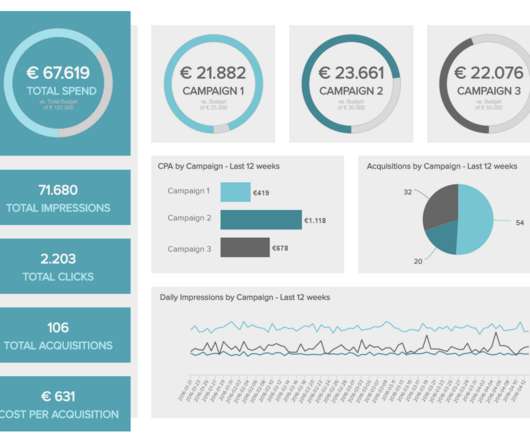
Management thinker Peter Drucker once stated, “if you can’t measure it, you can’t improve it” – and he couldn’t be more right. That’s why we will present annual, monthly, weekly, daily and digital marketing reports that you can use for your own promotional activities and upscale your marketing efforts.

Reporting 280