

Closing Data's Last-Mile Gap: Visualizing For Impact!
Occam's Razor
MARCH 19, 2018
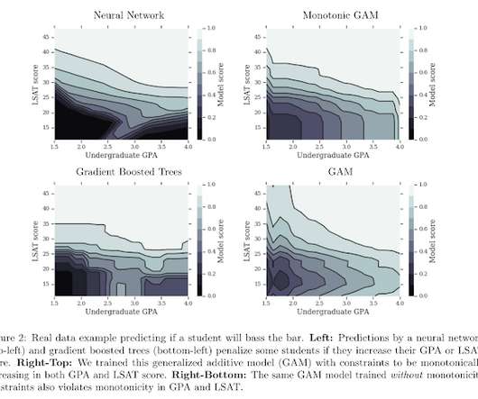
Experiment with visualization options, even in Excel! The bar chart is a sub-optimal way to let the audience see this. Consider experimenting with different visuals in Excel ( or D3js ). Consider experimenting with different visuals in Excel ( or D3js ). Why have two fat bars? The money needs to go to you!).


Let's personalize your content