Remove data charts
article thumbnail

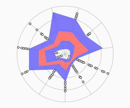
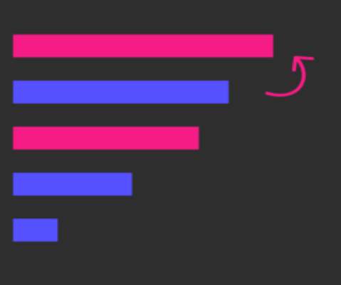
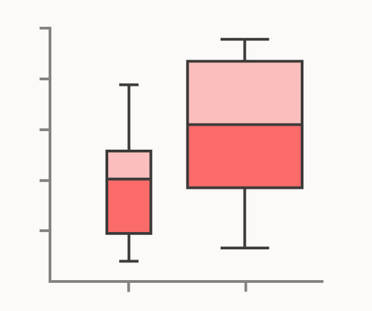
How to choose the Right Chart for Data Visualization

Analytics Vidhya

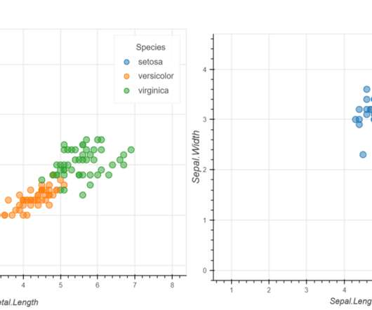
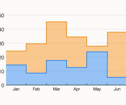
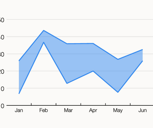
Overview What is Data Visualization How to choose the right chart for your data visualization By the end of this article, you will learn “How to choose the right chart for data visualization” Introduction I love data visualization.

article thumbnail

Lollipop Charts: Advanced Data Visualization in Python

Analytics Vidhya

ArticleVideo Book This article was published as a part of the Data Science Blogathon Like the evolution of humans, data visualization techniques have also been. The post Lollipop Charts: Advanced Data Visualization in Python appeared first on Analytics Vidhya.

Insiders

Sign Up for our Newsletter

This site is protected by reCAPTCHA and the Google Privacy Policy and Terms of Service apply.

article thumbnail

Cyberpunk Themed Charts: Advanced Data Visualization in Python

Analytics Vidhya

ArticleVideo Book This article was published as a part of the Data Science Blogathon Introduction Visualization leverages the power of data in getting insights and. The post Cyberpunk Themed Charts: Advanced Data Visualization in Python appeared first on Analytics Vidhya.

article thumbnail

8 Charts You Must Know To Excel In The Art of Data Visualization!

Analytics Vidhya

ArticleVideo Book This article was published as a part of the Data Science Blogathon Introduction Human beings are amongst the most creative species on this. The post 8 Charts You Must Know To Excel In The Art of Data Visualization! appeared first on Analytics Vidhya.

article thumbnail

Monetizing Analytics Features: Why Data Visualizations Will Never Be Enough

Think your customers will pay more for data visualizations in your application? Five years ago they may have. But today, dashboards and visualizations have become table stakes. Discover which features will differentiate your application and maximize the ROI of your embedded analytics. Brought to you by Logi Analytics.

article thumbnail

SQL for Data Visualization: How to Prepare Data for Charts and Graphs

KDnuggets

Unlock the Power of SQL in Data Visualization: Master the Art of Preparing Data for Impactful Charts and Graphs.

article thumbnail

Pie Chart Matplotlib: A Guide to Create and Customize Pie Charts

Analytics Vidhya

Introduction Pie charts, a widely used visualization tool, represent data proportions in a circular format. Here, we look into creating pie charts using Matplotlib. Importance of Pie Charts in Data Visualization Pie charts play a crucial role in data visualization for several reasons.

article thumbnail

Top 5 Analytics Features to Reach More Users with Valuable Data Insights

This eBook describes the key capabilities that product, IT, and business owners must consider when charting a plan to scale up business benefits from data and analytics. Ready to expand the benefits of your BI and analytics?