article thumbnail

What is Data Visualization: Complete Guide 2024

FineReport

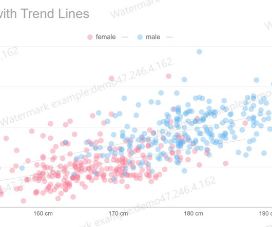
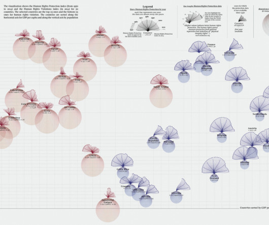
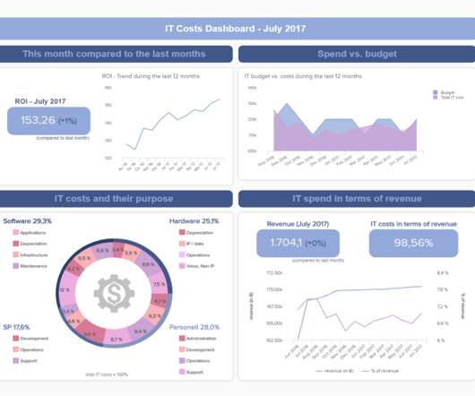
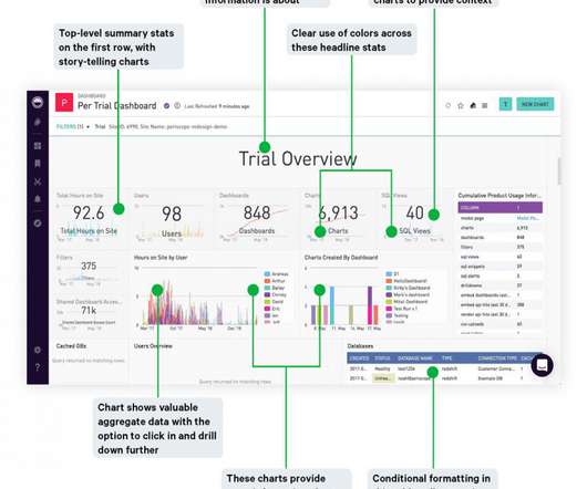
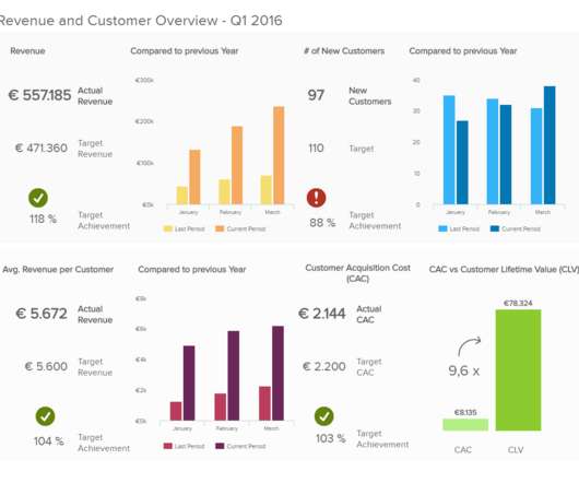
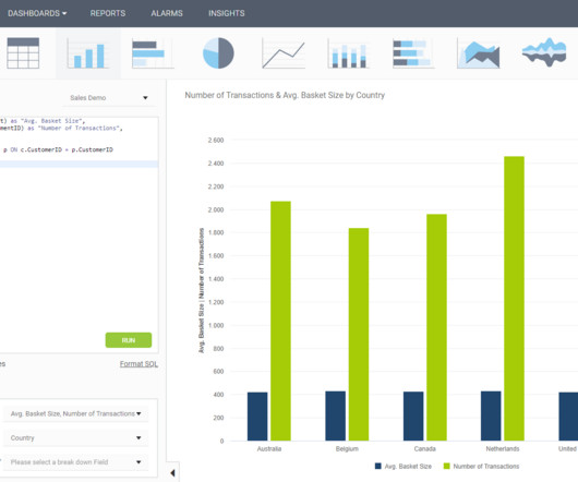
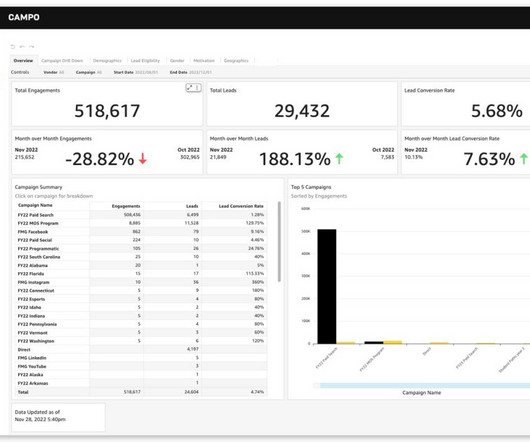
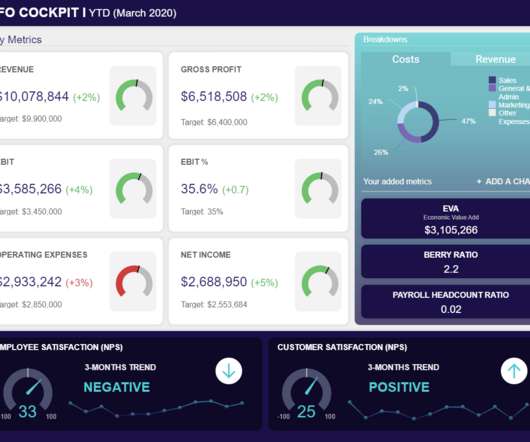
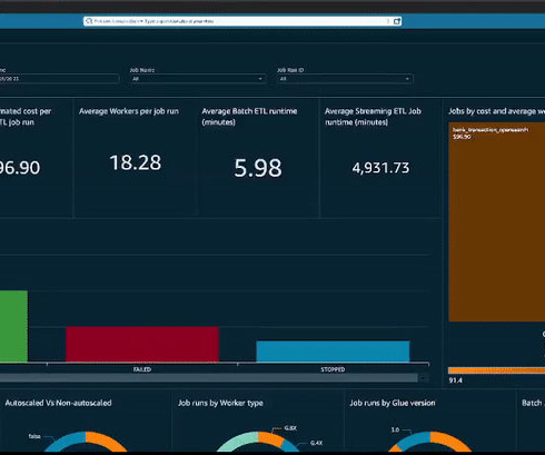
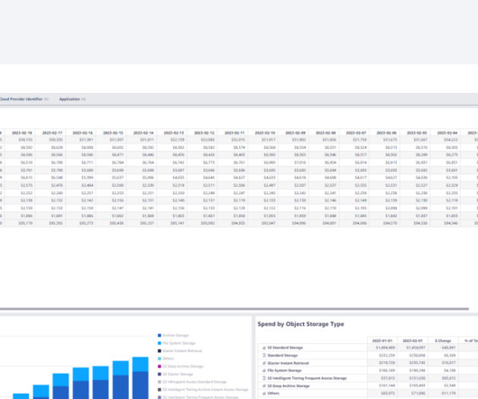
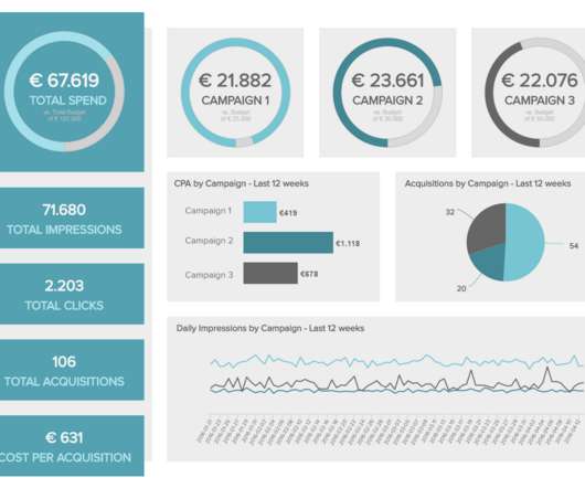
What is Data Visualization Understanding the Concept Data visualization, in simple terms, refers to the presentation of data in a visual format. By utilizing visual elements, data visualization allows individuals to grasp difficult concepts or identify new patterns within the data.

article thumbnail

Exploring Data Wonders: Data Visualization Examples & Considerations

FineReport

As the realm of data visualization undergoes rapid proliferation, diversifying applications, and evolving presentation formats, its expansive landscape unfolds. Mirroring the growth seen in other emerging concepts, the boundaries of data visualization remain in a state of continual expansion and is vital when you generate reports.

Insiders

Sign Up for our Newsletter

This site is protected by reCAPTCHA and the Google Privacy Policy and Terms of Service apply.

article thumbnail

6 ways generative AI can optimize asset management

IBM Big Data Hub

Every asset manager, regardless of the organization’s size, faces similar mandates: streamline maintenance planning, enhance asset or equipment reliability and optimize workflows to improve quality and productivity. Through interactive dialog, it can generate visual analytics and promptly deliver content to your team.

article thumbnail

Towards optimal experimentation in online systems

The Unofficial Google Data Science Blog

If the relationship of $X$ to $Y$ can be approximated as quadratic (or any polynomial), the objective and constraints as linear in $Y$, then there is a way to express the optimization as a quadratically constrained quadratic program (QCQP). However, joint optimization is possible by increasing both $x_1$ and $x_2$ at the same time.

article thumbnail

Enhance monitoring and debugging for AWS Glue jobs using new job observability metrics, Part 3: Visualization and trend analysis using Amazon QuickSight

AWS Big Data

QuickSight makes it straightforward for business users to visualize data in interactive dashboards and reports. Analyzing historical patterns allows you to optimize performance, identify issues proactively, and improve planning. You can deploy the end-to-end solution to visualize and analyze trends of the observability metrics.

Metrics 103
article thumbnail

10 Tips to Visualize Data Like a Pro

Juice Analytics

Have you nailed all the data visualization basics? But what does it take to get your visualizations to the next level? I want to share a collection of tips and tricks that differentiate a competently designed chart from a pro-level visualization. Stuff like… ?You You can spot chartjunk from a mile away; ?You Labeling; ?legends;

article thumbnail

Optimize queries using dataset parameters in Amazon QuickSight

AWS Big Data

With QuickSight, all users can meet varying analytic needs from the same source of truth through modern interactive dashboards, paginated reports, embedded analytics and natural language queries. We have introduced dataset parameters , a new kind of parameter in QuickSight that can help you create interactive experiences in your dashboards.