article thumbnail

3 Central Tendency Measures – Mean, Mode, Median

Analytics Vidhya

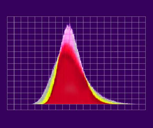
ArticleVideo Book This article was published as a part of the Data Science Blogathon. The post 3 Central Tendency Measures – Mean, Mode, Median appeared first on Analytics Vidhya. When we learn Data Science as beginners we came across.

article thumbnail

Remove Your Rose Tinted Glasses: Data Visualizations Designed to Mislead

datapine

1) Misleading Data Visualization Examples. 2) How to Avoid Misleading Visuals. 3) The Impact Of Bad Data Visualizations. But while that may be the case, people are duped by data visualizations every day. Bad data visualizations come in many forms, with some more obvious than others. Table of Contents.

Insiders

Sign Up for our Newsletter

This site is protected by reCAPTCHA and the Google Privacy Policy and Terms of Service apply.

Trending Sources

article thumbnail

Better Know a Visualization: Understanding Parallel Coordinates Charts

Juice Analytics

(With enough visualization methods to warrant a periodic table , it can be confusing to know what to use and when—and which visualizations are even worth considering at all. This series of posts is intended to introduce you to the visualization approaches that we find most useful, practical, and audience-friendly.)

article thumbnail

Data Visualization – How to Choose the Right Chart?

FineReport

For me, it’s data visualization. Now you know the charm of data visualization. Choosing the Right Chart to Make Data Visualization. The third dimension is measured by the area of each point. Maps are very attractive data visualization in these charts. Four B asic P rinciples of D ata Visualization.

article thumbnail

Chart Snapshot: Functional Box Plots

The Data Visualisation Catalogue

While this visualisation technique is a variation of the classic Box Plot , a Functional Box Plot is visually very different and instead plots a combination of lines and areas to communicate the various data ranges. This region provides a robust measure of the spread of the central 50% of the curves. IQR rule for traditional Box Plots.

article thumbnail

Take Advantage Of Operational Metrics & KPI Examples – A Comprehensive Guide

datapine

We have written about management reporting methods that can be utilized in the modern practice of creating powerful analysis, bringing complex data into simple visuals, and employ them to make actionable decisions. Your Chance: Want to visualize & track operational metrics with ease? What gets measured gets done.” – Peter Drucker.

KPI 269
article thumbnail

What Can Data Visualization Help in the Battle against the Novel Coronavirus?

FineReport

To this end, I’ve used the knowledge of data visualization to design dashboard templates for five scenarios, hoping to help relevant organizations or enterprises effectively monitor the epidemic situation and carry out prevention and control work. Top 16 Types of Chart in Data Visualization. Coronavirus outbreak analysis dashboard.