article thumbnail

Descriptive statistics | A Beginners Guide!

Analytics Vidhya

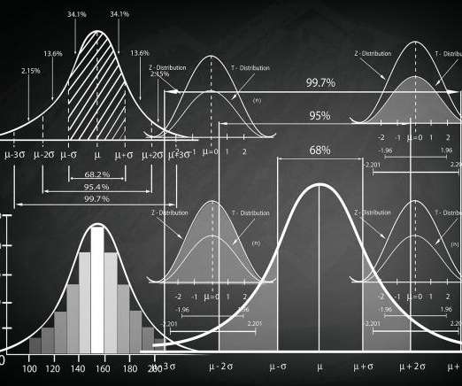
ArticleVideo Book This article was published as a part of the Data Science Blogathon Let us see a short intro about this blog, Descriptive Statistics. The post Descriptive statistics | A Beginners Guide! appeared first on Analytics Vidhya.

article thumbnail

Remove Your Rose Tinted Glasses: Data Visualizations Designed to Mislead

datapine

1) Misleading Data Visualization Examples. 2) How to Avoid Misleading Visuals. 3) The Impact Of Bad Data Visualizations. But while that may be the case, people are duped by data visualizations every day. Bad data visualizations come in many forms, with some more obvious than others. Table of Contents.

Insiders

Sign Up for our Newsletter

This site is protected by reCAPTCHA and the Google Privacy Policy and Terms of Service apply.

Trending Sources

article thumbnail

A Brief History of Data Visualization

Jet Global

Editors note: This blog was originally published in October 2013, and has been completely revamped and updated for accuracy, relevancy, and comprehensiveness in September 2019 Prior to the 17th century, data visualization existed mainly in the realm of maps, displaying land markers, cities, roads, and resources.

article thumbnail

Decoding the Chi-Square Test?-?Use, Implementation and Visualization

Analytics Vidhya

ArticleVideo Book This article was published as a part of the Data Science Blogathon Introduction In the last blog we looked at a test to. Use, Implementation and Visualization appeared first on Analytics Vidhya. The post Decoding the Chi-Square Test?-?Use,

Testing 159
article thumbnail

Why Nonprofits Shouldn’t Use Statistics

Depict Data Studio

— Thank you to Ann Emery, Depict Data Studio, and her Simple Spreadsheets class for inviting us to talk to them about the use of statistics in nonprofit program evaluation! But then we realized that much of the time, statistics just don’t have much of a role in nonprofit work. Why Nonprofits Shouldn’t Use Statistics.

article thumbnail

Top 7 Essential Cheat Sheets To Ace Your Data Science Interview

KDnuggets

The blog covers cheat sheets on SQL, statistics, pandas, data visualization, scikit-learn, Git, and theoretical data science concepts.

article thumbnail

Chart Snapshot: Functional Box Plots

The Data Visualisation Catalogue

While this visualisation technique is a variation of the classic Box Plot , a Functional Box Plot is visually very different and instead plots a combination of lines and areas to communicate the various data ranges. Median Curve: The median curve represents the most central observation and serves as a robust statistic for centrality.