Remove Data Processing Remove Interactive Remove Testing Remove Visualization
article thumbnail

Move Beyond Excel, PowerPoint And Static Business Reporting with Powerful Interactive Dashboards

datapine

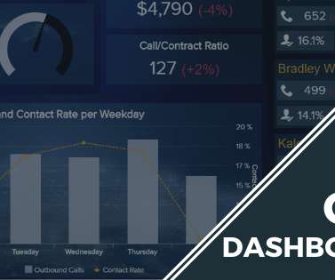
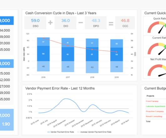
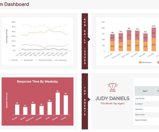
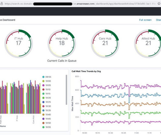
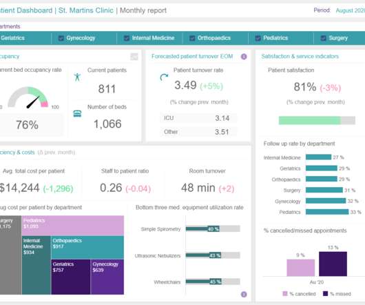
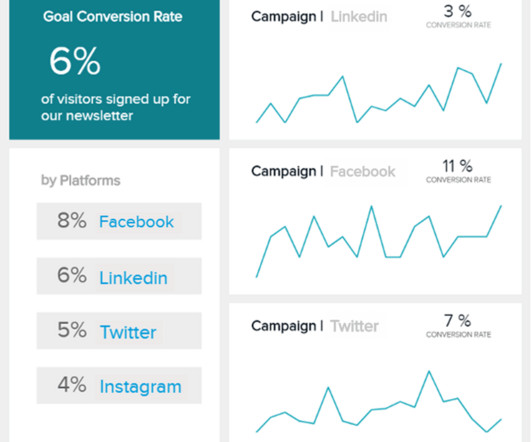
Visualizing the data and interacting on a single screen is no longer a luxury but a business necessity. That’s why we welcome you to the world of interactive dashboards. But before we delve into the bits and pieces of our topic, let’s answer the basic questions: What is an interactive dashboard, and why you need one?

article thumbnail

The Top 20 Data Visualization Books That Should Be On Your Bookshelf

datapine

Now that you’re sold on the power of data analytics in addition to data-driven BI, it’s time to take your journey a step further by exploring how to effectively communicate vital metrics and insights in a concise, inspiring, and accessible format through the power of visualization. They can be fun and interactive, too.

Insiders

Sign Up for our Newsletter

This site is protected by reCAPTCHA and the Google Privacy Policy and Terms of Service apply.

article thumbnail

Find the best Amazon Redshift configuration for your workload using Redshift Test Drive

AWS Big Data

In this post, we answer that question by using Redshift Test Drive , an open-source tool that lets you evaluate which different data warehouse configurations options are best suited for your workload. Redshift Test Drive uses this process of workload replication for two main functionalities: comparing configurations and comparing replays.

Testing 63
article thumbnail

Apply Modern CRM Dashboards & Reports Into Your Business – Examples & Templates

datapine

Finally, we will show you a real-life example so you can get a visual overview and a clearer picture of the points discussed in this article. At its core, CRM dashboard software is a smart vessel for data analytics and business intelligence – digital innovation that hosts a wealth of insightful CRM reports. Let’s begin.

article thumbnail

Monetizing Analytics Features: Why Data Visualizations Will Never Be Enough

Think your customers will pay more for data visualizations in your application? But today, dashboards and visualizations have become table stakes. Five years ago they may have. Discover which features will differentiate your application and maximize the ROI of your embedded analytics. Brought to you by Logi Analytics.

article thumbnail

What Is Ad Hoc Reporting? Your Guide To Definition, Meaning, Examples & Benefits

datapine

Moreover, a host of ad hoc analysis or reporting platforms boast integrated online data visualization tools to help enhance the data exploration process. Ad hoc data analysis offers an interactive reporting experience, empowering end-users to make modifications or additions in real-time. Easy to use: .

Reporting 260
article thumbnail

Best BI Tools For 2024 You Need to Know

FineReport

Harnessing the power of advanced APIs, automation, and AI, these tools simplify data compilation, organization, and visualization, empowering users to extract actionable insights effortlessly. These tools seamlessly connect and consolidate data from diverse sources, ensuring cleanliness, structure, and aggregation of data in various formats.