Remove 2016 Remove Modeling Remove Visualization
article thumbnail

13 Essential Data Visualization Techniques, Concepts & Methods To Improve Your Business – Fast

datapine

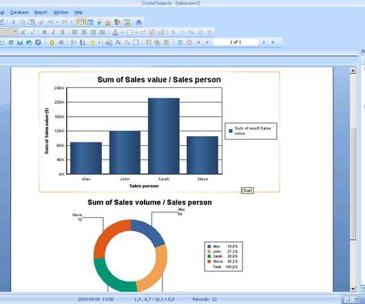
“By visualizing information, we turn it into a landscape that you can explore with your eyes. 90% of the information transmitted to the brain is visual. Data visualization methods refer to the creation of graphical representations of information. That’s where data visualization comes in. A sort of information map.

article thumbnail

Closing Data's Last-Mile Gap: Visualizing For Impact!

Occam's Razor

Experiment with visualization options, even in Excel! Consider experimenting with different visuals in Excel ( or D3js ). Once you arrive at that conclusion, you’ll apply principle #4 and realize that the most interesting data on this slide is not the visual… Rather, it is the table on the top right corner of the slide.

Insiders

Sign Up for our Newsletter

This site is protected by reCAPTCHA and the Google Privacy Policy and Terms of Service apply.

article thumbnail

What are Different Kinds of Data Visualization?

FineReport

What is Data Visualization? Data visualization provides clear, fast and effective communication according to graphical means. From the user’s point of view, data visualization allows users to quickly grasp the key points of information, which can help them make better and wiser decisions. Area & Size Visualization.

article thumbnail

Top 10 IT & Technology Buzzwords You Won’t Be Able To Avoid In 2020

datapine

Exciting and futuristic, the concept of computer vision is based on computing devices or programs gaining the ability to extract detailed information from visual images. Visual analytics: Around three million images are uploaded to social media every single day. Artificial Intelligence (AI).

article thumbnail

Analyzing Tabular Model in Excel 2016

Ms SQL Girl

It’s been a long time since I wrote an article on Tabular Model. In this article, I want to show you how to connect to your Tabular Model database and use it as the underlying model for either Pivot Table, Pivot Chart, or Power View. Connecting to Tabular Model in Excel. i.e. Pivot Table, Pivot Chart or Power View.

article thumbnail

Enterprise Data Science Workflows with AMPs and Streamlit

Cloudera

Fitting Prophet models with complex seasonalities for electricity demand forecasting. Understanding the technologies underlying these examples – both what they can do, and how they work – relied heavily on exploration and visualization. We can explore model behaviour, as in Few-Shot Text Classification.