article thumbnail

Cyber Fraud Statistics & Preventions to Prevent Data Breaches in 2021

Smart Data Collective

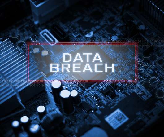
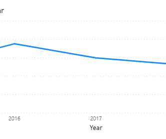
In this blog post, we discuss the key statistics and prevention measures that can help you better protect your business in 2021. Cyber fraud statistics and preventions that every internet business needs to know to prevent data breaches in 2021. In 2019, the number of people affected by cyber fraud in the U.S.

article thumbnail

Top 10 Charts in 2019

The Data Visualisation Catalogue

2019 has been a busy year for me, hence the lack of posts on this blog. However, I would still like to continue producing content for this blog and not neglect it. But now that 2019 is over, I had to take the time to cover the most popular chart reference pages on this website for the year.

Insiders

Sign Up for our Newsletter

This site is protected by reCAPTCHA and the Google Privacy Policy and Terms of Service apply.

article thumbnail

How to Visualize Confidence Intervals in Presentation Slides

Depict Data Studio

Do you need to share statistics in presentations? In this blog post, you’ll learn how to explain dense graphs one slide at a time, which makes it easier for our audience to follow along. If you work in public health, then you know that the tiny text and statistical terminology is pretty common in scientific graphs.

article thumbnail

Top 10 Charts in 2022

The Data Visualisation Catalogue

It’s always worthwhile to analyse the website statistics, as they may provide some indicator of what visualisation types are most commonly being referenced and read up about. Top 10 Charts in 2019. The post Top 10 Charts in 2022 appeared first on The Data Visualisation Catalogue Blog. Hope this has been of interest.

article thumbnail

Top 10 Charts in 2021

The Data Visualisation Catalogue

Another year has passed now and a new set of website statistics for 2021 is here, which will reveal what visualisation reference pages are the most popular. It’s always good to analyse the website statistics, as they may provide some indicator of what visualisation types are most commonly being used or taught.

article thumbnail

A Brief History of Data Visualization

Jet Global

Editors note: This blog was originally published in October 2013, and has been completely revamped and updated for accuracy, relevancy, and comprehensiveness in September 2019 Prior to the 17th century, data visualization existed mainly in the realm of maps, displaying land markers, cities, roads, and resources.

article thumbnail

Top 10 Charts in 2020

The Data Visualisation Catalogue

2020 is finally over, so as per tradition the publishing of the website statistics on the most popular chart reference pages is to be obliged. So let’s explore the website statistics from the recent past year with a series of tables and visualizations.