The Easiest Way to Make Beautiful Interactive Visualizations With Pandas
KDnuggets
DECEMBER 28, 2021
Check out these one-liner interactive visualization with Pandas in Python.
This site uses cookies to improve your experience. By viewing our content, you are accepting the use of cookies. To help us insure we adhere to various privacy regulations, please select your country/region of residence. If you do not select a country we will assume you are from the United States. View our privacy policy and terms of use.
KDnuggets
DECEMBER 28, 2021
Check out these one-liner interactive visualization with Pandas in Python.
FineReport
JUNE 17, 2021
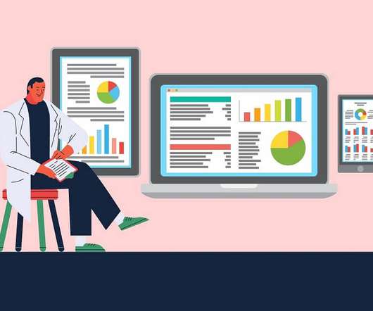
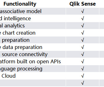
Nowadays, almost all businesses from all works believe in the potential of excellent BI tools to create stunning visualizations and effectively convey business information. There are many BI tools on the market that have potentially efficient visualization capabilities for customers to use. What are BI Visualization Tools?
This site is protected by reCAPTCHA and the Google Privacy Policy and Terms of Service apply.
Peak Performance: Continuous Testing & Evaluation of LLM-Based Applications
Manufacturing Sustainability Surge: Your Guide to Data-Driven Energy Optimization & Decarbonization
From Developer Experience to Product Experience: How a Shared Focus Fuels Product Success
Understanding User Needs and Satisfying Them
Beyond the Basics of A/B Tests: Highly Innovative Experimentation Tactics You Need to Know
FineReport
OCTOBER 25, 2021
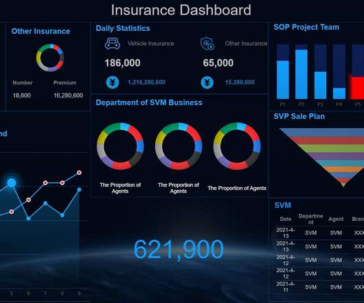
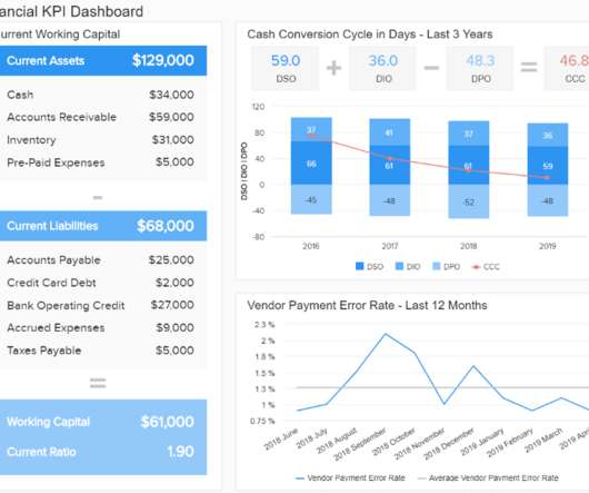
Similar to the instrument panel equipped in a car, it transforms obscure expertise into plain visualizations which are pleasing to both the eye and mind. A data dashboard is a useful tool that could display and analyze users’ complex data by means of data visualization so that the user gains a deep insight into the value of data.
Peak Performance: Continuous Testing & Evaluation of LLM-Based Applications
Manufacturing Sustainability Surge: Your Guide to Data-Driven Energy Optimization & Decarbonization
From Developer Experience to Product Experience: How a Shared Focus Fuels Product Success
Understanding User Needs and Satisfying Them
Beyond the Basics of A/B Tests: Highly Innovative Experimentation Tactics You Need to Know
Paul Blogs on BI
JULY 16, 2021
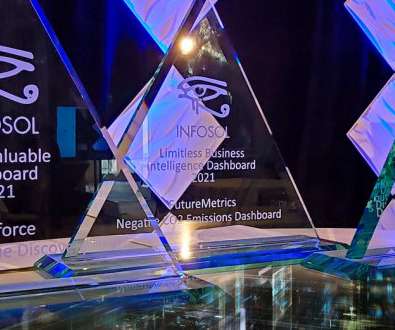
Here are the categories and the winners: The 2021 Best Business Dashboard Award. The Best Business Dashboard award for 2021 was awarded to McKesson for their Drug Distribution dashboard. The 2021 Limitless BI Dashboard Award. The 2021 Most Valuable Dashboard Award. Congratulations!
Juice Analytics
MAY 3, 2021
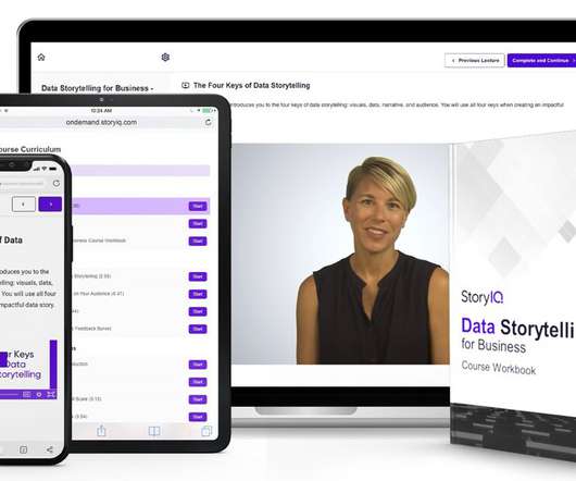
If you are looking for a packaged course that will teach you about data visualization, narrative, and engaging your audience, we’ve tracked down some of the best options. By the end of the course, learners will have the skills needed to produce impactful data visualizations layered with compelling narratives. Cost: Starts at $99.
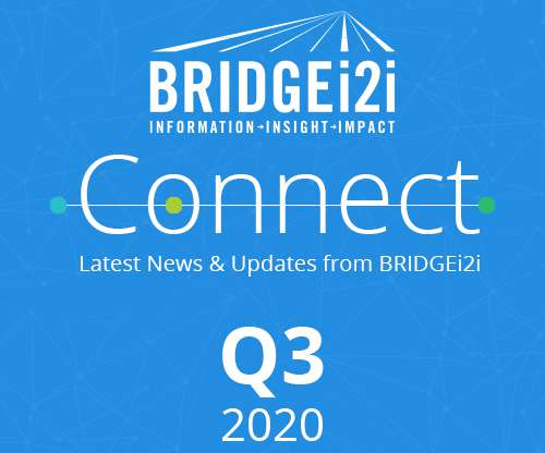
bridgei2i
MARCH 8, 2021
As we step into 2021 with hope and renewed strength, it’s time to Reimagine your Business…with AI! We took an interactive perspective on tracking the aftermath of COVID-19 in different scenarios; through data visualization. Wishing you all a great 2021! Newsletter Q3 2020. Happy New Year! 2020 – Accolades for BRIDGEi2i.
FineReport
NOVEMBER 6, 2021
After the sorting of data and the individual design of visual presentation, large screen visualization for enterprises can be achieved in Java framework. From heatmaps to histograms, graphs to geomaps, Grafana Java dashboard fast & flexible visualizations any way you want. Java Dashboard ?From From FineReport?.
CIO Business Intelligence
APRIL 28, 2022
Announced in 2021, Flow is a low-code tool which initially consolidated various process automation and workflow tools for Salesforce users to build workflows between the various parts of the Salesforce suite. This is automation on one unified CRM platform. Let’s take them one by one. Flow Integration for Mulesoft.
datapine
MARCH 6, 2023
The results can later be displayed in an interactive HR report. Facilitate professional development 63% of employees who left their jobs in 2021 listed a lack of opportunities for career advancement as a reason for their decision. You can make these surveys anonymous to ensure psychological safety and encourage candid feedback.
datapine
MARCH 31, 2022
billion by the end of 2021. For example, if you enjoy computer science, programming, and data but are too extroverted to program all day long, you could work in a more human-oriented area of intelligence for business, perhaps involving more face-to-face interactions than most programmers would encounter on the job.
Ontotext
DECEMBER 20, 2023
As knowledge graphs have made their way into more and more areas of our lives through smarter search and immersive information navigation, they are also gradually turning into the default way we expect to interact with knowledge. Caption: A visual graph for the property “Biscuits” in EOKG. van Erp, M., Bembibre, C., and Leemans, I.
The Data Visualisation Catalogue
DECEMBER 13, 2021
Bar Charts are distinguished from the visually very similar Histogram, as they do not display continuous data over an interval. Visual Arrangements of Bar Charts Influence Comparisons in Viewer Takeaways. Eurographics Conference on Visualization (EuroVis). An Evaluation of the Impact of Visual Embellishments in Bar Charts.
CIO Business Intelligence
APRIL 6, 2022
To be considered fully accessible, websites must accommodate visual, auditory, cognitive, neurological, physical and speech disabilities. A 2021 study of the world’s top million websites found that 97.4 based developer of training, tools and testing technology for website accessibility. That’s a tricky order.
CIO Business Intelligence
JANUARY 13, 2023
Empty shelves cost US retailers $82 billion in missed sales in 2021 alone, according to an analysis from NielsenIQ. Shelf-checking technology for inventory at physical retail stories has been a sought-after capability since low — or no — inventory is a troubling issue for retailers.
CIO Business Intelligence
OCTOBER 13, 2022
Flockey made its first debut at the Eurovision Song Contest at the Rotterdam Ahoy in May 2021. Flockey provides his team with a dashboard for real-time visualization of crowd movement and risks. ESRI mapping adds powerful geospatial analysis on top of 3D mapping for full visualization of what’s happening in real time. “EY
IBM Big Data Hub
MARCH 8, 2024
Social commerce, a form of ecommerce in which a social media platform serves as both a marketing channel and a shopping destination, is expected to grow by more than 50% between 2021 and 2025. The ecommerce market has grown exponentially over the last decade. trillion globally by 2025.
Jet Global
FEBRUARY 14, 2023
Logi Embedded Analytics and Business Intelligence from insightsoftware enable software teams to rapidly design, build, and embed interactive dashboards and data visualizations. insightsoftware has invested in expanding its Embedded Analytics offerings since acquiring Logi Analytics in April 2021.
Cloudera
DECEMBER 9, 2022
In 2021 we launched Cloudera DataFlow for the Public Cloud (CDF-PC) , addressing operational challenges that administrators face when running NiFi flows in production environments. A reimagined visual editor to boost developer productivity and enable self service. Interactivity when needed while saving costs.
CIO Business Intelligence
MAY 17, 2022
Following the migration to Amazon Connect in June 2021 and Amazon Connect Self Service six months later, the company has saved $50,000. Ciena has also enabled integration with ServiceNow and to Amazon Lex for natural language and automated customer interactions, the CIO says. Connect isn’t the only AWS service Ciena is relying on.
CIO Business Intelligence
JULY 20, 2023
From 250 such stores in 2021, the study forecasts the number to touch 12,000 by 2027. Immersive shopping meets these needs by building interactive experiences for customers, thereby increasing their chances of making the purchase. With an increase in online shopping, there has also been a spike in identity theft and payment fraud.
datapine
SEPTEMBER 27, 2022
We have already given you our top data visualization books , top business intelligence books , and best data analytics books. Recently published in 2021, “SQL for Data Scientists” by author and experienced data scientist, Rénee Teate, teaches its readers all the skills that data scientists use the most in their daily work.
IBM Big Data Hub
JUNE 20, 2023
Emerging cloud-based technology trends like artificial intelligence (AI) , the Metaverse, the Internet of Things (IoT) and edge computing are evolving at a rapid pace, seemingly adding new capabilities every few months to fundamentally transform how people and organizations interact with them.
FineReport
MAY 23, 2021
It has been recognized in the Honorable Mention of the 2021 Gartner Magic Quadrant for Analytics and Business Intelligence Platforms. On top of these, FineReport’s data visualization package offers a wide variety of visualization options such as 3D charts, maps, GIS relationships, dashboards. Free Download. Source: Zoho.
Smart Data Collective
MAY 5, 2021
They can be useful for social media marketers that need fresh visual content. A year of lockdown has really affected the way audiences have been interacting with highly edited photos. Some trending topics of 2021 include race relations, female empowerment, and gender rights. Stripped Back Realism.
AWS Big Data
MARCH 13, 2024
Visual layouts in some screenshots in this post may look different than those on your AWS Management Console. Query the data using Athena Athena is a serverless, interactive analytics service built to analyze unstructured, semi-structured, and structured data where it is hosted. You’re now ready to query the tables using Athena.
FineReport
AUGUST 17, 2021
In general, digital dashboard integrates all key performance indicators and data into the dashboard of the same business area, so as to visually display the current status and historical trends of the company, and further assist the company’s decision-making. Introduction of FineReport. Strengths of FineReport ’ s digital dashboard.
AWS Big Data
APRIL 12, 2023
With it, we found an intuitive product with rich visualizations that we could build and grow with rapidly, allowing us to innovate without monetary risks or being locked in to cumbersome contracts. In 2021, over 80% of cyber breaches involved human error of some kind. Quick visualizations of learners’ scoring in Snack Attack!
FineReport
MARCH 29, 2023
Introduction to Qlik Sense Qlik Sense is an interactive BI product released by QlikTech in 2014. Users can create visual reports according to their own wishes and achieve self-service analysis. Users can create visualized reports according to their own preferences and achieve self-service analysis.
Smart Data Collective
MARCH 5, 2021
It is enough motivation to start email marketing for your small business in 2021 if you are still not doing it. Depending on the purpose, you should choose mobile-optimized email templates that look visually appealing and render the information effortlessly. For every dollar invested, email marketing generates an ROI of $51.
IBM Big Data Hub
DECEMBER 4, 2023
The assistant can then provide visualizations and text explanations, attributing the increase to factors like seasonality, specific events or even suggesting potential data entry errors. Users can define thresholds and conditions for identifying anomalies or adjust their plans and strategies accordingly.
IBM Big Data Hub
MAY 9, 2022
28, 2021. [2]. The global pandemic accelerated adoption of digital interactions with businesses out of necessity and highlighted for customers the benefits of a business that was attuned to their specific needs online, in-person, and in hybrid situations (such as curbside). The cost of ignoring these imperatives is staggering.
datapine
JANUARY 24, 2021
We’ve already explained them and recognized them as one of the biggest business intelligence trends for 2021. The visual reports you provide them with should be easy-to-use and actionable. 8) What data visualizations should you choose? There are a number of online data visualization tools that can get the hard work done for you.
Jen Stirrup
JULY 15, 2021
What can you do to make your customer interactions more interesting? For example, your customer to come to your site to interact with a chatbot. The chatbots could automate the whole process from interaction, to purchase, right through to delivery of the product and ensuring payment. Attention spans can be very limited, however.
Ontotext
DECEMBER 16, 2020
Revisit this post for an in-depth look into all the features including support for declarative Role-Based Access Controls, GraphQL Mutation, GraphQL Federation, GraphQL schema generation (from RDFS/OWL), DockerHub Images, Helm Charts, and Platform monitoring graphs and visualizations.
CIO Business Intelligence
AUGUST 14, 2023
IT worked with the hospital’s clinic operations group to build “EmmiJourneys,’’ a series of automated scripts that were a blend of engaging and educational content in the form of interactive voice response calls and multimedia videos targeting patients based on their needs. IT ran a pilot in 2021 with one instructor.
Sisense
JANUARY 7, 2022
According to Statista , risk management experts state that the 2021 pandemic outbreak was a greater business risk to small companies than it was to mid-sized or larger companies. Smarter, AI-driven learning and development initiatives will help mitigate risk in our rapidly evolving world.
Cloudera
APRIL 9, 2021
The third video in the series highlighted Reporting and Data Visualization. According to the 2021 State of Enterprise ML ‘the time required to deploy a model is increasing, with 64% of all organizations taking a month or longer” and “38% of organizations spend more than 50% of their data scientists’ time on deployment.”
erwin
MAY 2, 2022
It’s not very hard at all once you know the definition and have some rather simple visual examples. Video: Empower 2021: Fireside chat – Model-driven DevOps – What Is It? Video: Empower 2021: Mitigating the risk associated with sensitive data across the enterprise. Figure 11: Data normalization. Join a group today.
IBM Big Data Hub
JUNE 7, 2022
In October 2021, the White House Office of Science and Technology Policy announced, “ Americans Need a Bill of Rights for an AI-Powered World.” Now it can become a competitive advantage for brands that invest in automating explanations with easy-to-understand visuals. In the U.S., Automate governance and trustworthiness of AI at scale.
IBM Big Data Hub
FEBRUARY 8, 2022
To effectively manage the program, we need to work with the parents, through hundreds of interactions, for hundreds of kids,” said Executive Director Jerry Yang, Ph.D., In fact, despite the COVID pandemic, 65% of Kai Ming’s children advanced at least one development level in the 2021 academic year. About Head Start.
AWS Big Data
APRIL 25, 2024
VPC endpoints are created for Amazon S3 and Secrets Manager to interact with other resources. The Amazon provider is used to interact with AWS services like Amazon S3, Amazon Redshift Serverless, AWS Glue, and more. Choose Graph to visualize the DAG in a graph format. the latest version as of writing this post).
datapine
SEPTEMBER 16, 2022
Now that you’re sold on the power of data analytics in addition to data-driven BI, it’s time to take your journey a step further by exploring how to effectively communicate vital metrics and insights in a concise, inspiring, and accessible format through the power of visualization. They can be fun and interactive, too.
The Data Visualisation Catalogue
JANUARY 24, 2023
This is probably due to this tool demonstrating the potential to revolutionise the way we search and interact with information over the internet. Limited knowledge ChatGPT is a machine learning model that was trained on a dataset of text up to the year 2021. What are the limitations of ChatGPT?
Alation
SEPTEMBER 28, 2022
Alation provides robust DataOps solutions that help you foster collaboration, build trusted data solutions, automate testing & monitoring, and visualize data pipelines. Daily Interactions. What Are The Principles of DataOps? As DataOps is a methodology, it can vary depending on its industry and application. It’s a Team Sport.
Expert insights. Personalized for you.
We have resent the email to
Are you sure you want to cancel your subscriptions?
Let's personalize your content