article thumbnail

The Top 20 Data Visualization Books That Should Be On Your Bookshelf

datapine

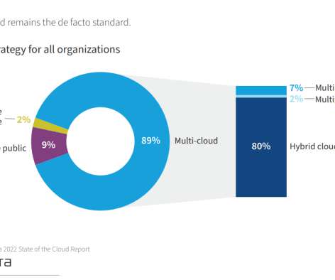
Now that you’re sold on the power of data analytics in addition to data-driven BI, it’s time to take your journey a step further by exploring how to effectively communicate vital metrics and insights in a concise, inspiring, and accessible format through the power of visualization. That’s a colossal number of books on visualization.

article thumbnail

The DataOps Vendor Landscape, 2021

DataKitchen

Download the 2021 DataOps Vendor Landscape here. DataOps is a hot topic in 2021. DataOps needs a directed graph-based workflow that contains all the data access, integration, model and visualization steps in the data analytic production process. The post The DataOps Vendor Landscape, 2021 first appeared on DataKitchen.

Testing 300
Insiders

Sign Up for our Newsletter

This site is protected by reCAPTCHA and the Google Privacy Policy and Terms of Service apply.

Trending Sources

article thumbnail

Top Three Data Visualization Trends in Finance and Accounting for 2021

Jet Global

In his classic work, the Visual Display of Quantitative Information , Edward R. Tufte powerfully illustrates the impact that data visualization can have on real-world decisions. He provides a second example in which the absence of data visualization leads to the opposite outcome. Shortly afterward, the epidemic came to an end.

article thumbnail

Chart Snapshot: Functional Box Plots

The Data Visualisation Catalogue

While this visualisation technique is a variation of the classic Box Plot , a Functional Box Plot is visually very different and instead plots a combination of lines and areas to communicate the various data ranges. This region provides a robust measure of the spread of the central 50% of the curves. IQR rule for traditional Box Plots.

article thumbnail

Checklist of Data Dashboard for 2021? Definition, Examples & More

FineReport

Similar to the instrument panel equipped in a car, it transforms obscure expertise into plain visualizations which are pleasing to both the eye and mind. A data dashboard is a useful tool that could display and analyze users’ complex data by means of data visualization so that the user gains a deep insight into the value of data.

article thumbnail

10+ Government KPIs for 2021 Reporting

Jet Global

A government key performance indicator (KPI) is a quantifiable measure that the public sector uses to evaluate its performance. This tool will help you understand what performance measures to track, and which dashboards best suit your needs. The baseline is measured when the KPIs are first identified. What are Government KPIs?

Reporting 104
article thumbnail

BRIDGEi2i Newsletter: July 2021 Recap

bridgei2i

Q4 Newsletter 2021. A non-profit, global hub is developing an AI-powered anthropometry tool that measures newborn babies' weight with a video app that creates a 3D reconstruction to determine the approximate weight, so underweight babies can get all the medical care they deserve. BRIDGEi2i can help you Reimagine your Business with AI.