Remove category r
article thumbnail

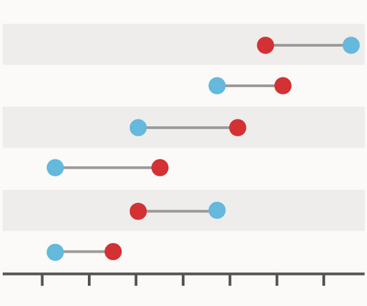
Chart Snapshot: Dumbbell Plot

The Data Visualisation Catalogue

It is particularly effective for comparing quantitative value ranges across different categories, offering a clear visualisation of the differences or changes between them. The categories or groups are typically represented along one axis, while the quantitative values are plotted along the other axis.

article thumbnail

Chart Snapshot: Beeswarm Plot

The Data Visualisation Catalogue

Additionally, colour can be used to represent different categories or an additional variable. This method ensures all data points remain visible, enhancing the visibility of density and variation.

Insiders

Sign Up for our Newsletter

This site is protected by reCAPTCHA and the Google Privacy Policy and Terms of Service apply.

article thumbnail

Chart Snapshot: 100% Stacked Area Graphs

The Data Visualisation Catalogue

The X-axis is used for the time scale, which makes this chart ideal for showing the changing overall percentages of categories over time. The data series for each category is colour-coded, which helps to illustrate a part-to-whole relationship. One solution to this issue could be to group minor categories under an ‘other’ category.

article thumbnail

New Format for The Bar Chart Reference Page

The Data Visualisation Catalogue

First, locate the value scale axis and the category axis, to identify what is being visualised. Each category is assigned its own bar and the length of each bar is proportional to the value it represents. Colour-coding can be assigned to the bars to distinguish each category in the dataset. ” in each category.

article thumbnail

Chart Snapshot: Variable Width Bar Charts

The Data Visualisation Catalogue

In essence, each bar in the chart can represent a specific category, such as different product lines or demographic groups. Rather than all bars being of uniform width, as in conventional bar charts, the width of the bars in a Variable Width Bar Chart is determined by an additional dimension within the dataset.

article thumbnail

10 Open Source and Free Data Visualization Tools You Can’t-Miss

FineReport

Free data visualization tools are professional in different categories: dashboard, chart, maps, network, and so on. FineReport provides more than 19 categories and 50+ styles of HTML5 charts. Category : Reports and Dashboards. Category : charts and graphs. Category : charts and graphs. From FineReport. From Google.

article thumbnail

Data Science Tools: Understanding the Multiverse

Domino Data Lab

While there are certainly engineers and scientists who may be entrenched in one camp or another (the R camp vs. Python, for example, or SAS vs. MATLAB), there has been a growing trend towards dispersion of data science tools. Key categories of tools and a few examples include: Data Sources. They range from flat files (e.g.