Remove 2017 Remove Blog Remove Reporting Remove Visualization
article thumbnail

Modifying GANTT Charts inside Power BI

Jet Global

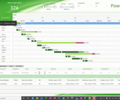
Background After coming to America 3 years ago and learning DAX through Power Pivot Pro’s excellent intro to Tabular models, I met the founder of Power ON, Per Solli in Los Angeles in 2017. Power ON’s toolkit opens up completely new opportunity with their Power BI Write-Back Features, and their custom visuals.

article thumbnail

Closing Data's Last-Mile Gap: Visualizing For Impact!

Occam's Razor

I see reports, dashboards, presentations with wide gaps. If you pause and consider how this data is collected, via a small triple digit sample self-reported survey results, you’ll quickly realize that the error range in this data is likely a few points. If so, is the data for August 2017 really adding value?

Insiders

Sign Up for our Newsletter

This site is protected by reCAPTCHA and the Google Privacy Policy and Terms of Service apply.

Trending Sources

article thumbnail

Academic Research Done on Alluvial Diagrams

The Data Visualisation Catalogue

This was the first paper to introduce the “Alluvial Diagram” and used this new visualisation to visually represent the change in a large and complex network structure over time. Detecting Dynamics of Hot Topics with Alluvial Diagrams: A Timeline Visualization (2017). Visualizing changes in nationally averaged PM2.5

article thumbnail

Create Modern SQL Dashboards With Professional Tools & Software

datapine

In some cases, you will need a coding solution where you can build your own queries, but in others, you will also look for a visual representation of your realational data. How To Create SQL Dashboards – Coding & Visuals. The good news is that you can utilize both with the help of a modern and professional SQL dashboard.

article thumbnail

Challenges in replacing SSRS with Microsoft Power BI

BizAcuity

There are several reporting tools and platforms available today, and enterprises usually choose the one that is best suited for their business needs. Two popular options for reporting platforms are SQL Server Reporting Services (SSRS) and Microsoft Power BI. It is an intensified tool compared to other crystal reports.

article thumbnail

Taking Federal Grant Data from Dull to Dynamite with Custom Visualizations

Depict Data Studio

In this blog post, I’m going to explain how you can easily create a customized chart that will make your federal grant data conversations a breeze. These were the goals for my project: Visualize the federal grant Allocation amounts for each school district, so the breakdown of funds can be seen at a glance.

article thumbnail

10 Big Data Examples Showing The Great Value of Smart Analytics In Real Life At Restaurants, Bars, and Casinos

datapine

In 2017 the company wanted to take its shopping experience one step further by creating an augmented reality app that allowed users to test a product without having to leave their homes. It does this by using Artwork Visual Analysis (AVA) “a collection of tools and algorithms designed to surface high-quality imagery from videos.

Big Data 244