article thumbnail

Designing Visual Appendices for Your Next Report—In Under an Hour

Depict Data Studio

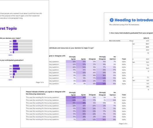
A couple years ago, I worked on this report: This report summarized survey responses from both universities and their students. Even with hundreds of survey responses and dozens of survey questions, we kept the report’s body to just six pages! How’d we choose which findings to include in the report’s main body?!

article thumbnail

Closing Data's Last-Mile Gap: Visualizing For Impact!

Occam's Razor

I see reports, dashboards, presentations with wide gaps. If you pause and consider how this data is collected, via a small triple digit sample self-reported survey results, you’ll quickly realize that the error range in this data is likely a few points. If so, is the data for August 2017 really adding value?

Insiders

Sign Up for our Newsletter

This site is protected by reCAPTCHA and the Google Privacy Policy and Terms of Service apply.

article thumbnail

Academic Research Done on Alluvial Diagrams

The Data Visualisation Catalogue

This was the first paper to introduce the “Alluvial Diagram” and used this new visualisation to visually represent the change in a large and complex network structure over time. Detecting Dynamics of Hot Topics with Alluvial Diagrams: A Timeline Visualization (2017). Visualizing changes in nationally averaged PM2.5

article thumbnail

Modifying GANTT Charts inside Power BI

Jet Global

Background After coming to America 3 years ago and learning DAX through Power Pivot Pro’s excellent intro to Tabular models, I met the founder of Power ON, Per Solli in Los Angeles in 2017. Power ON’s toolkit opens up completely new opportunity with their Power BI Write-Back Features, and their custom visuals.

article thumbnail

Monetizing Analytics Features: Why Data Visualizations Will Never Be Enough

Think your customers will pay more for data visualizations in your application? But today, dashboards and visualizations have become table stakes. Five years ago they may have. Discover which features will differentiate your application and maximize the ROI of your embedded analytics. Brought to you by Logi Analytics.

article thumbnail

Data Visualization = Special Powers

Depict Data Studio

While I’ll never reach her level of data visualization wizardry, I’ve learned a few things. Data visualization and chart selection was a huge challenge. Now: The 2017 Results. Many of my clients experience their output data only during reporting season, and mainly as a check-the-box funding requirement.

article thumbnail

Create Modern SQL Dashboards With Professional Tools & Software

datapine

In some cases, you will need a coding solution where you can build your own queries, but in others, you will also look for a visual representation of your realational data. How To Create SQL Dashboards – Coding & Visuals. The good news is that you can utilize both with the help of a modern and professional SQL dashboard.