article thumbnail

BI Visualization Tools: Top 5 Picks 2021

FineReport

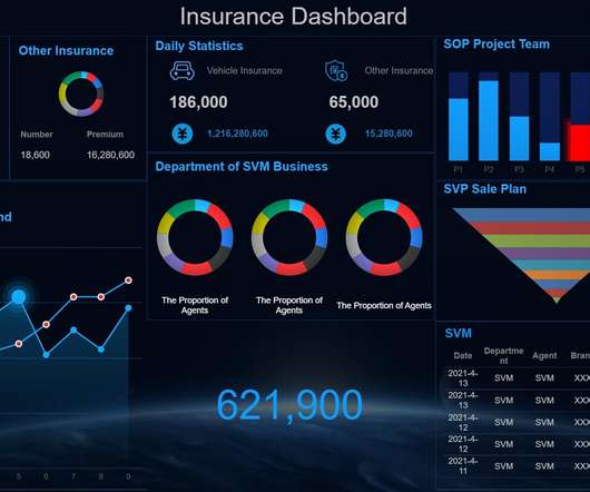
Nowadays, almost all businesses from all works believe in the potential of excellent BI tools to create stunning visualizations and effectively convey business information. There are many BI tools on the market that have potentially efficient visualization capabilities for customers to use. What are BI Visualization Tools?

article thumbnail

AI Adoption in the Enterprise 2021

O'Reilly on Data

The percentage of respondents reporting “mature” practices has been roughly the same for the last few years. This is almost exactly in line with the results from 2020, where 25% of the respondents reported that they had products in production (“Mature” wasn’t a possible response in the 2020 survey.). Asia has clearly caught up.

Insiders

Sign Up for our Newsletter

This site is protected by reCAPTCHA and the Google Privacy Policy and Terms of Service apply.

article thumbnail

Top 5 Report Maker Software & Reporting Software

FineReport

How to Make Reports Outstanding? In the era of data driving the decision, the importance of reporting and analytics is increasingly recognized by organizations. Two things can help you be a great report maker. The first is clear design thinking, and the second is efficient report writing software. Report Maker Tool List.

article thumbnail

Inform Your 2021 By Looking At the Most Popular Finance Content of 2020

Jet Global

The lessons we have all learned from the changes 2020 brought can give you an advantage in 2021. COVID-19 brought a new urgency to financial reporting, with businesses needing to have an accurate view of their cash flow in order to inform future planning. Best CFO KPIs and Dashboards for the 2021 CFO. Make Pivot Tables Great.

Finance 105
article thumbnail

Chart Snapshot: Area Bands

The Data Visualisation Catalogue

Area Bands enhance standard Line Graphs by filling the space between upper and lower value lines with a shaded area, providing a visual representation of the range boundaries. Essentially, this is a visual enhancement to a graph, which offers more detail and context to data changing over time.

article thumbnail

BRIDGEi2i Newsletter: January 2021 Recap

bridgei2i

As we step into 2021 with hope and renewed strength, it’s time to Reimagine your Business…with AI! Download Report. We took an interactive perspective on tracking the aftermath of COVID-19 in different scenarios; through data visualization. Wishing you all a great 2021! Newsletter Q3 2020. Happy New Year!

article thumbnail

Four popular Java Dashboards for 2021 ——Examples

FineReport

Featuring ‘expertise, simplicity, flexibility’, FineReport can create the simplest report and large screen, with users commanding the skill of SQL. After the sorting of data and the individual design of visual presentation, large screen visualization for enterprises can be achieved in Java framework. Java Dashboard ?From