Remove Article Remove Interactive Remove Measurement Remove Visualization
article thumbnail

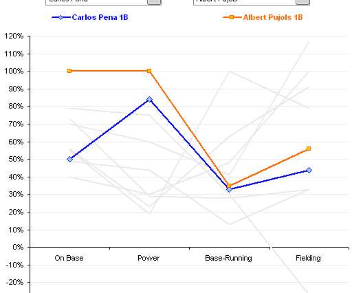
Better Know a Visualization: Understanding Parallel Coordinates Charts

Juice Analytics

(With enough visualization methods to warrant a periodic table , it can be confusing to know what to use and when—and which visualizations are even worth considering at all. This series of posts is intended to introduce you to the visualization approaches that we find most useful, practical, and audience-friendly.)

article thumbnail

Take Advantage Of Operational Metrics & KPI Examples – A Comprehensive Guide

datapine

We have written about management reporting methods that can be utilized in the modern practice of creating powerful analysis, bringing complex data into simple visuals, and employ them to make actionable decisions. Your Chance: Want to visualize & track operational metrics with ease? What gets measured gets done.” – Peter Drucker.

KPI 269
Insiders

Sign Up for our Newsletter

This site is protected by reCAPTCHA and the Google Privacy Policy and Terms of Service apply.

article thumbnail

The AI cat and mouse game has begun

CIO Business Intelligence

If you are a CIO or CISO and haven’t yet read this article – Finance worker pays out $25 million after video call with deepfake ‘chief financial officer,’ you should and then share it with your entire company. To counter AI-generated threats, CIOs and CISOs must deploy AI-based defensive measures. Whom can you trust?

Finance 120
article thumbnail

Towards Better Visualizations: Part II - How to be More Effective

Darkhorse

In that last post , we introduced the concept of The Visualization Frontier. It’s a simple rubric to measure the effectiveness of your data visualization. We hinted at the possibility that the red line is not the same for everyone - that it’s tied to your capability as a data visualizer. (We How do you do so?

article thumbnail

A Guide To The Methods, Benefits & Problems of The Interpretation of Data

datapine

Through the art of streamlined visual communication, data dashboards permit businesses to engage in real-time and informed decision-making and are key instruments in data interpretation. Interval: a measurement scale where data is grouped into categories with orderly and equal distances between the categories.

article thumbnail

Your Definitive Guide To KPI Tracking By Utilizing Modern Software & Tools

datapine

By measuring KPIs regularly and automatically, you can increase productivity and decrease costs. . By selecting the right KPIs for various areas of the business, it’s possible to use them to arrange as well as visualize large datasets. To track KPIs is to gain greater business intelligence. Primary KPIs: Customer Acquisition Costs.

KPI 195
article thumbnail

Top 10 Management Reporting Best Practices To Create Effective Reports

datapine

By the end of this article, making stunning and useful managerial reports will be second nature to you. When these reports are backed up with powerful visualizations developed with a dashboard creator , no information can stay hidden, eliminating thus the possibility of human errors and negative business impact.

Reporting 263