


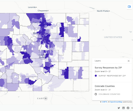
STCU Visualizes Data to Improve Member Services
Information Builders
SEPTEMBER 25, 2017
STCU Visualizes Data to Improve Member Services. Regional Credit Union Gains an Analytics Advantage With WebFOCUS. Taking analytics to the next level was important for the Spokane Teachers Credit Union (STCU).


Let's personalize your content