article thumbnail

Insurance Dashboard Design: KPIs, Analytics & Examples

FineReport

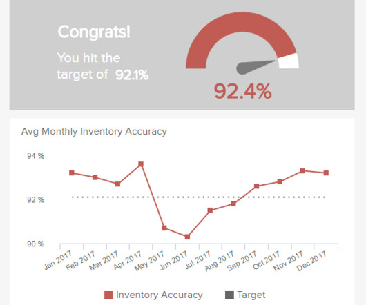
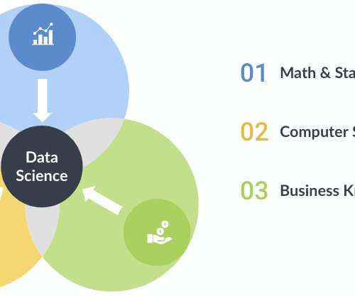
Insurance companies provide risk management in the form of insurance contracts. Industry-specific, comprehensive, and reliable data management and presentation have become an issue of increasing concern in the insurance industry. The insurance dashboard is one of the most commonly used data display methods.

article thumbnail

Interview with: Sankar Narayanan, Chief Practice Officer at Fractal Analytics

Corinium

I am the Chief Practice Officer for Insurance, Healthcare, and Hi-Tech verticals at Fractal. The Insurance practice is currently engaged with several top 10 P&C insurers in the US, across the Insurance value chain through AI, Engineering, Design & Behavioural Sciences programs.

Insurance 250
Insiders

Sign Up for our Newsletter

This site is protected by reCAPTCHA and the Google Privacy Policy and Terms of Service apply.

Trending Sources

article thumbnail

Harmonize data using AWS Glue and AWS Lake Formation FindMatches ML to build a customer 360 view

AWS Big Data

We use Amazon Neptune to visualize the customer data before and after the merge and harmonization. Overview of solution In this post, we go through the various steps to apply ML-based fuzzy matching to harmonize customer data across two different datasets for auto and property insurance.

article thumbnail

Create an Apache Hudi-based near-real-time transactional data lake using AWS DMS, Amazon Kinesis, AWS Glue streaming ETL, and data visualization using Amazon QuickSight

AWS Big Data

Then we can query the data with Amazon Athena visualize it in Amazon QuickSight. ticket_activity" where ticketactivity_id = 46 ; Visualize the data in QuickSight After you have the output file generated by the AWS Glue streaming job in the S3 bucket, you can use QuickSight to visualize the Hudi data files. Choose Visualize.

article thumbnail

How Data Storytelling Can Build Better Customer Connections

Juice Analytics

It also wants to convince existing customers that they made the right decision in choosing State Farm for their insurance. They have designed a Juicebox report that provides an interactive exploration of weekly and historical results. Simple to understand means using charts and visualizations that are intuitive and well-understood.

article thumbnail

Storytelling for CIOs: From niche to bestseller

CIO Business Intelligence

“I always find there’s benefit in using a story to help my audience understand what can sometimes be very technical concepts that I’m trying to communicate to non-technical people,” says Adam Miller, CIO of UK insurer, Markerstudy Group. Second, detail the story characters and how they interact, with examples.

article thumbnail

Bubble Wrap: How Eurovision Monitors Covid Risk at Events

CIO Business Intelligence

Flockey provides his team with a dashboard for real-time visualization of crowd movement and risks. From the dashboard they can see employees and visitors’ proximity, the location of the interactions, and the time of the interaction – with risk levels registered as low, medium, or high – and take appropriate action. .

Risk 88